
LoopMe – Corporate Website
Corporate Website
LoopMe
Executive summary
The project focuses on redesigning LoopMe’s corporate website to facilitate its transition from a startup to an established leader in advertising. Grounded in a thorough analysis of usability issues, the goal is to improve the site’s information architecture through user research, competitive benchmarking, and iterative testing.
Over four weeks, key enhancements simplified navigation and improved content presentation, resulting in positive feedback from internal teams and clients. Notably, sales team members reported increased confidence in sharing the site. This user-centered approach emphasises collaboration and effective integration of insights, positioning LoopMe for ongoing improvements
My role
User research, Information architecture, Wireframing, Validating & Testing
Timeframe: 4 weeks (Before handoff to development)
Background
LoopMe is a London-based DSP / AD networks company that delivers mobile-only advertising campaigns. Learn more about LoopMe.
A design team of two
I worked for three years at LoopMe as Head of Creative, leading a team of five designers between London and New York City. After this wonderful experience I decided to shift working as a freelance UI and UX designer.
During the last stage of my time at LoopMe, I was asked to redesign the corporate website, with the possibility of working on the project in collaboration with a fellow designer from the creative team.
Considering the amount of work involved, we decided to divide up the tasks between us in a way that would allow us to work autonomously, while also still providing each other mutual support as needed.
I took care of the user experience part, while Jane, my colleague redesigned the user interface and the graphic content of the site’s pages.
The process
Our process for LoopMe was based on the Double Diamond Framework. We aimed to incorporate the key phases of Discovery, Definition, Ideation and Implementation in the project.

Understanding the problem
During the first meeting with the company’s stakeholder and marketing manager, I decided to create a list of the issues the company perceived with their website. This list would later help me to check if the perceived problems were indeed real.
During this meeting I took the opportunity to explain the process we would follow in the redesign of the website. This is a crucial step, as not all clients are fully aware of how important the preliminary investigation is before starting to design or update a product.
Starting the research & analytics
Unfortunately only basic Google Analytics were implemented on the website, with no specific interactions tracking, heatmaps or scroll user percentage. In this occasion the analytics was not useful during the research.
At the end of the project I will explain how we implemented in the new website a solid Google Analytics setup.
On a product redesign, I usually start the research by exploring any available analytics and then I move investigating how competitors have decided to tackle the design issue I know I will probably have to face later on. Involving the client in the decision about which competitors to choose to analyze is key, as this gives me a general idea of their expectations for the end product.
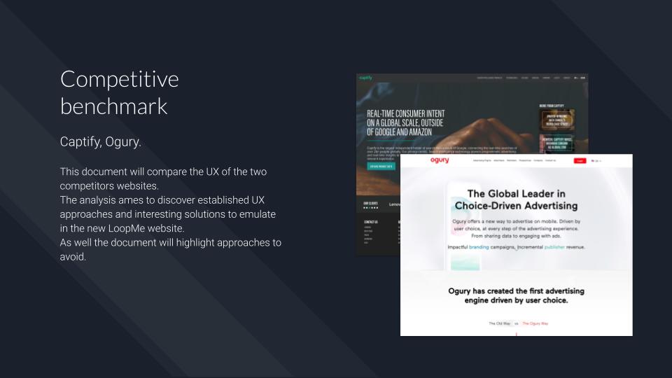
With the help of the marketing team my colleague and I identified two competitors that occupied the same tier in the market as LoopMe: Captify and Ogury. I then ran a competitive benchmark on their websites.
Competitive analisys outcome
During the benchmarking I took care of two different tasks. The first was to identify established strategies for displaying content of this specific type of users, the second task was a content audit of the competitors’ websites, the aim of which was to see if a broadly similar information architecture to these websites could be used for LoopMe.
Below are some outcomes of our investigation:
- Narrative strategy: Ogury conveys the content of its main pages using a narrative. This narrative approach creates a hook which captures and sustains the user’s interest.
- Minimal graphics and animations: Ogury uses simple and minimalistic graphics. Certain elements are animated, which creates visual interest without being distracting.
- Crosslink: The crosslink strategy is used in both websites. It guides the user through the main pages regardless of where their journey begins.
- Clean over cool: Despite its AI and high tech focus, no visual or design gimmicks are employed that dilute the message or trivialise the brand (i.e. overly futuristic or sci-fi designs)
- Established content hierarchy: The layout of specific categories/ elements have the same patterns on both websites. E.g. Client’s logos, short explanation of the page content at the top of each page etc
Browse the competitive benchmark below, alternatively use the following link: LoopMe Competitive Benchmark
Learning
It’s very important not to be influenced by the competitive benchmark to the point of emulating a large part of a competitor’s product just because it looks well done. While it’s not necessary to completely reinvent the wheel, it’s also a sound strategy to use the design of a good product as a departure point for constructing something that will serve your client better.
In this case Ogury’s website was a reference point for several design choices we made.
Selecting the right participants
The next step in the research involved conducting moderate face-to-face user testing and an online survey.
With the help of the marketing team, we established the different categories of users who visit the company’s website. It is worth highlighting that LoopMe is a B2B business, therefore the most common user is highly skilled and knows what they are looking for.
- The site is dedicated to advertisers, who are the main users. It is the users who move the company’s business. It is advertisers who contact LoopMe in order to deliver a campaign on a specific geographic area and targeting a specific group of users.
- Publishers are another category of user. Publishers are the websites and apps through which LoopMe delivers the advertising campaigns.
- The final group of users is other, non-specific visitors. Such visitors can be candidates for a job interview who want to find out information about the company, or potential investors, for instance both of these categories are quite important because LoopMe is a fast growing startup.
User testing outcome
Five participants were interviewed for user testing. The choice of participants fell among LoopMe clients and among subjects working in the same sector. Face to face user testing helped me establish whether the existing website posed any navigation problems for users, but more importantly users’ expectations and mental models about where certain information should be found on the website.
This user testing helped me to prioritise users’ needs over company priorities when it came to establishing the information architecture later on.
The main issues identified by advertisers and publishers were similar: A lack of a solid list of case studies, expectations of page content completely conflicting with reality and a generally poor opinion of the graphics of the entire website.
The online survey was completed by twenty candidates. This part of the research was dedicated to the non-specific user, whose main need is to attain a general understanding of the company. Overall the survey respondents had a generally positive impression of the website.
Browse the user testing script here: LoopMe User Testing Script
An example of a user testing can be found below. See here the related note taking: LoopMe Note taking
Convergent research
At this point in the research I had enough data to begin the convergent phase.
I shared the data I had acquired with my colleague designer, selected members of the marketing and data scientist team, and asked them to carefully read the research documentation I had compiled.
This first workshop involved the construction of an affinity diagram of all the gathered data (the diagram was digitized in Miro in order to more easily share it with the team) and the creation of three proto personas based on the data I had obtained.
Personas
Three personas were created based on the research data and the subsequent workshop with the marketing team.
- Primary persona: This is the Advertiser. The company’s main category of client and the primary user of the website. I decided to give this persona a junior role, with the added characteristic of a sharpened sense of independence in her day to day tasks – The website must be easy to understand and navigate, terminology must be specific but simple at the same time.
- Secondary persona: This is the Publisher. the LoopMe collaborator. I decided to give this persona a demanding senior role. In this way I created a priority conflict between a senior demanding user, which expects to be treated as the most important client, and the real primary client, a junior user who would accept to work hard in order to find the information needed. I hoped this conflict would lead to a good compromise during the design of the information architecture.
- Negative persona: This is the atypical user. I created this user as a way of ensuring that the website would be navigable and informative even for outlying, irregular or unrepresentative users.
The persona profiles and names were shared with everyone collaborating on the project. I asked the team from this point onwards to cease referring to ‘users’ and instead refer to the personas by name. This helped the team focus on the most probable use cases for the website, rather than designing for a plethora of ill-defined users with a long list of vague and never-ending needs.
Browse the three personas below, alternatively use the following link: LoopMe Personas


Learning
Sometimes using personas is a gamble. In this specific case the use of personas helped me fine-tune the information architecture for a specific group of users; the use of personas was also well accepted by the marketing team and by the other stakeholders.
Sometimes personas are not taken seriously by project stakeholders. After all, they are fictional characters albeit based on studies of the average user. I have learned how crucial it is to explain the importance of personas to those who are not familiar with the concept. Here an interesting article by the Nielsen Norman Group about why Personas can often fail.
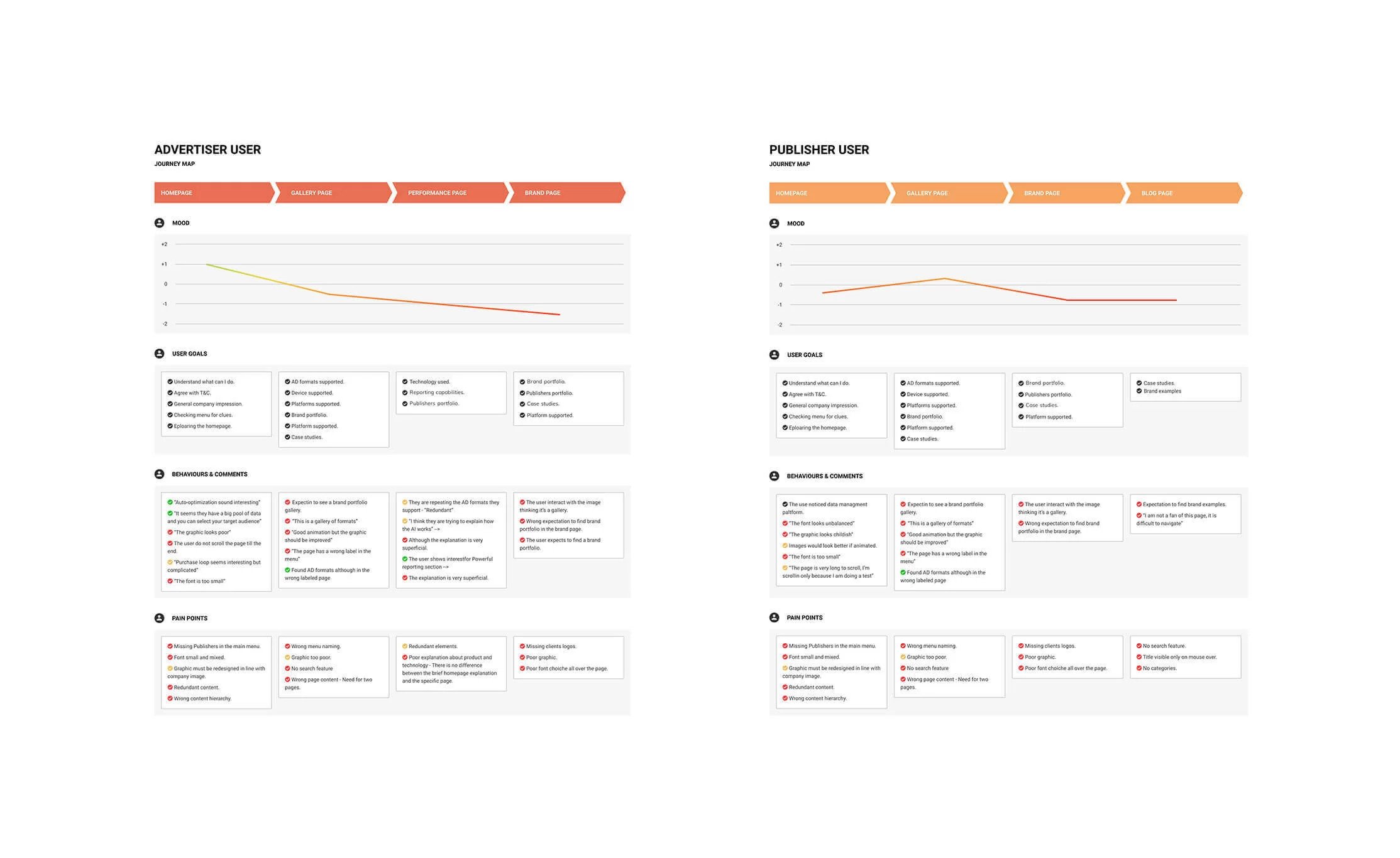
User journey maps
The research phase was completed with the design of two user journey maps. The requirement for the need for two different journey maps is due to the double user target of the website: Advertiser and Publisher. Even though both curves show a negative experience for both users, it was still possible to use the positive comments to guide us in the construction of elements of the new site.
See the user journey maps below for a quick overview, alternatively open the Figma file: LoopMe Customer Journey Map
Priorities & IA
During the second workshop my colleague and I focused on building the information architecture for the new website with the help of the the Marketing team.
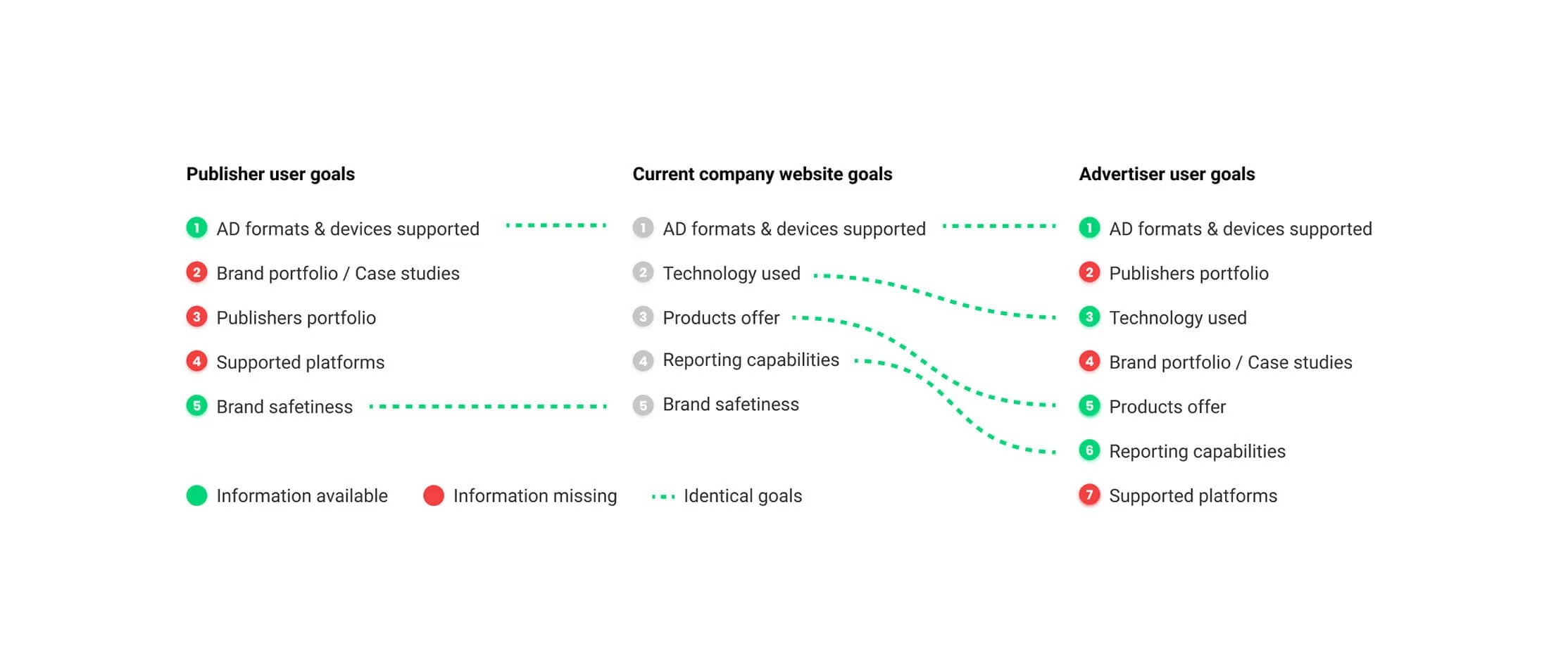
At the beginning of the workshop I shared a chart that outlined user priorities versus company priorities (user priorities are the user goals when they visit the website, and company priorities are the information the company wishes to emphasise on the website). We discovered the secondary persona was the most penalised user, in fact with the current priorities hierarchy, the publisher could reach only two goals out of five.
We then prepared together the cards to use during the the next step of the project.
The graphic below compares the Advertiser’s and the Publisher’s goals with LoopMe’s priorities for the old website.
Card sorting
The next exercise involved the cards we drafted with the Marketing team, analysing the content audit of the LoopMe website and the corresponding content audit of the competitor’s websites. The aim of this analysis was to be able to run a card sorting session. Using users’ goals versus company goals, we were able to draft the foundation of the new information architecture.
We decided to execute the card sorting exercise with a few clients and a few members of the Publisher team.
The cards with the specific name of the content were divided in groups in order to define a new menu and a new sitemap.


Learning
The gold standard exercise to test the Information Architecture in a pre-existing website is a tree testing. In this case we decided to run a card sorting as we were already aware about several issues encountered by users in the menu.
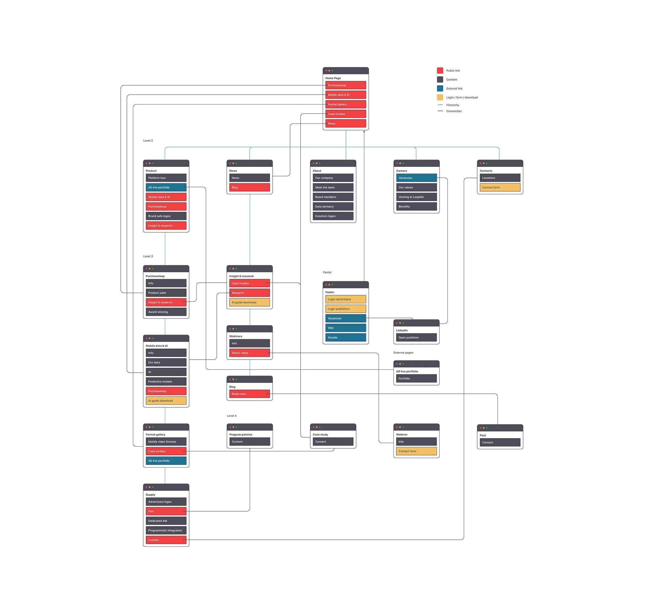
Sitemap
In order to sign off the new information architecture, I designed a sitemap based on the outcomes of the card sorting session.
The hierarchy is distributed over three levels. The homepage has been updated with all the priorities of the primary persona (the advertiser), with an introduction to the topics and a link to a dedicated second or third level page. The main priorities of the secondary user (the publisher) were grouped into a third level page, reachable in one click via the main menu.
See the sitemap below for a quick overview, alternatively open the Figma file: LoopMe Sitemap
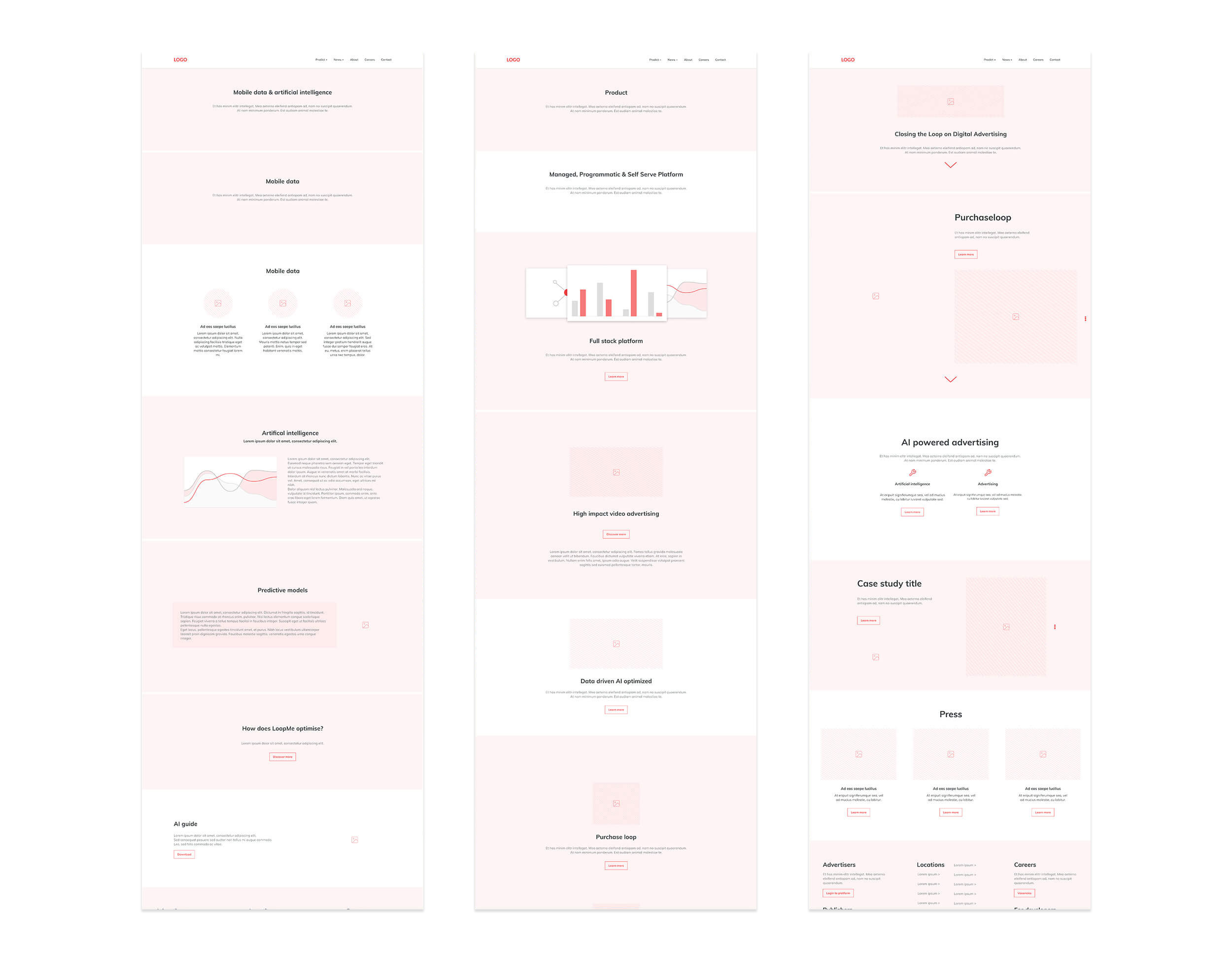
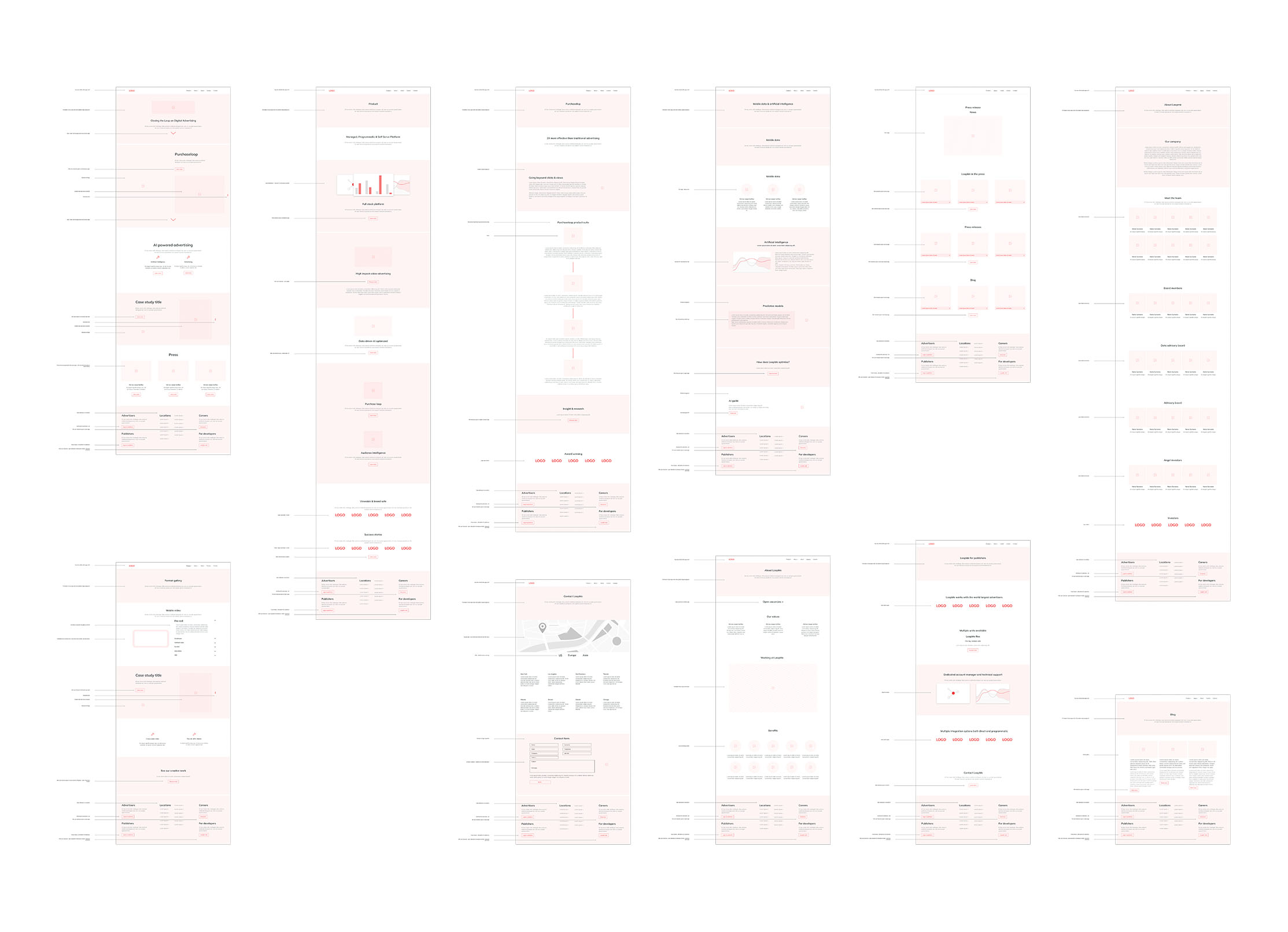
Wireframing
I started the convergent phase of the design process with a low fidelity wireframing. Although I like to sketch with pencil and paper, I believe that using a graphics tablet speeds up the process. In this way I can reuse the same components by simply cloning what I have already sketched.
Between the LO-FI and HI-FI wireframing there were several revisions of the sketches with the creative team, marketing and the stakeholder. When we reached a consolidated pages structure I started the HI-FI wireframing in Figma, adding a detailed description of interactions, behaviors and suggestions for the UI designer.
See the HI-FI wireframes below for a quick overview, alternatively open the Figma file: LoopMe Wireframes
Learning
When the final user interface is not being designed by me, I don’t like going into too much detail during the wireframe process. Although the graphical accuracy may seem low fidelity, the interactions and information architecture are extremely accurate.
I prefer to leave the UI designer freedom to make decisions about font type and size, as well as the length of transitions and animations (e.g. parallax effects). Involving the UI designer in every step of the research process sets them in good stead to make these design decisions later.
IA testing & reiterate
The testing of the website content was carried after the website visual-design and development.
I used Lookback to test the content of the new website with 10 participants. The test was remote and unmoderated, with participants assigned the task of finding a specific set of information on the site. The result of this test was positive, and no changes to the new information architecture were required.
Watch a sample of this test using the following links: Test 1 – Test 2
Analytics & AB Testing
In order to monitor the website after its delivery, I implemented Google Analytics, setting goals and Events to optimise CTAs and interactions for primary and secondary Personas. (Hotjar was implemented for a short time in order to capture heatmaps)
We decided to run a series of AB Testing on a few pages (manely for content amendments) through Google Optimise.
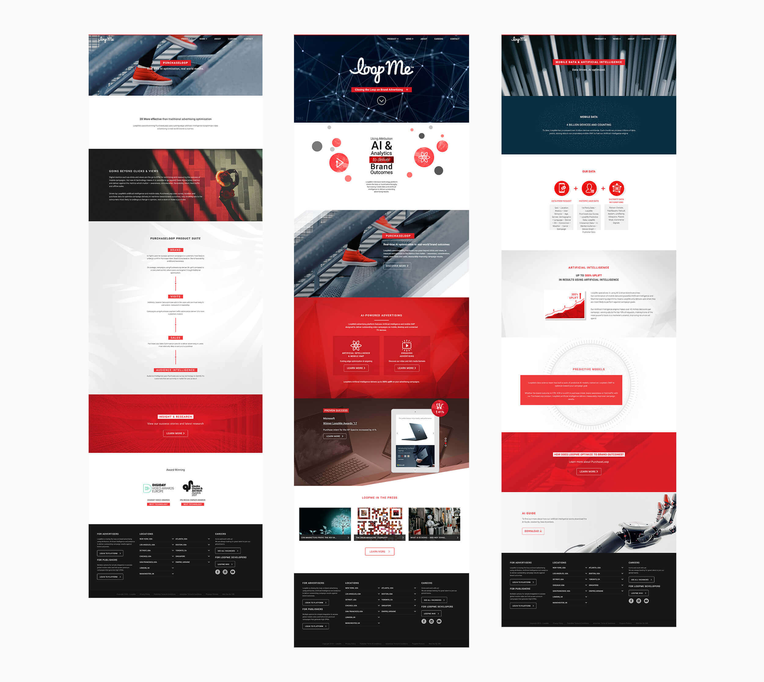
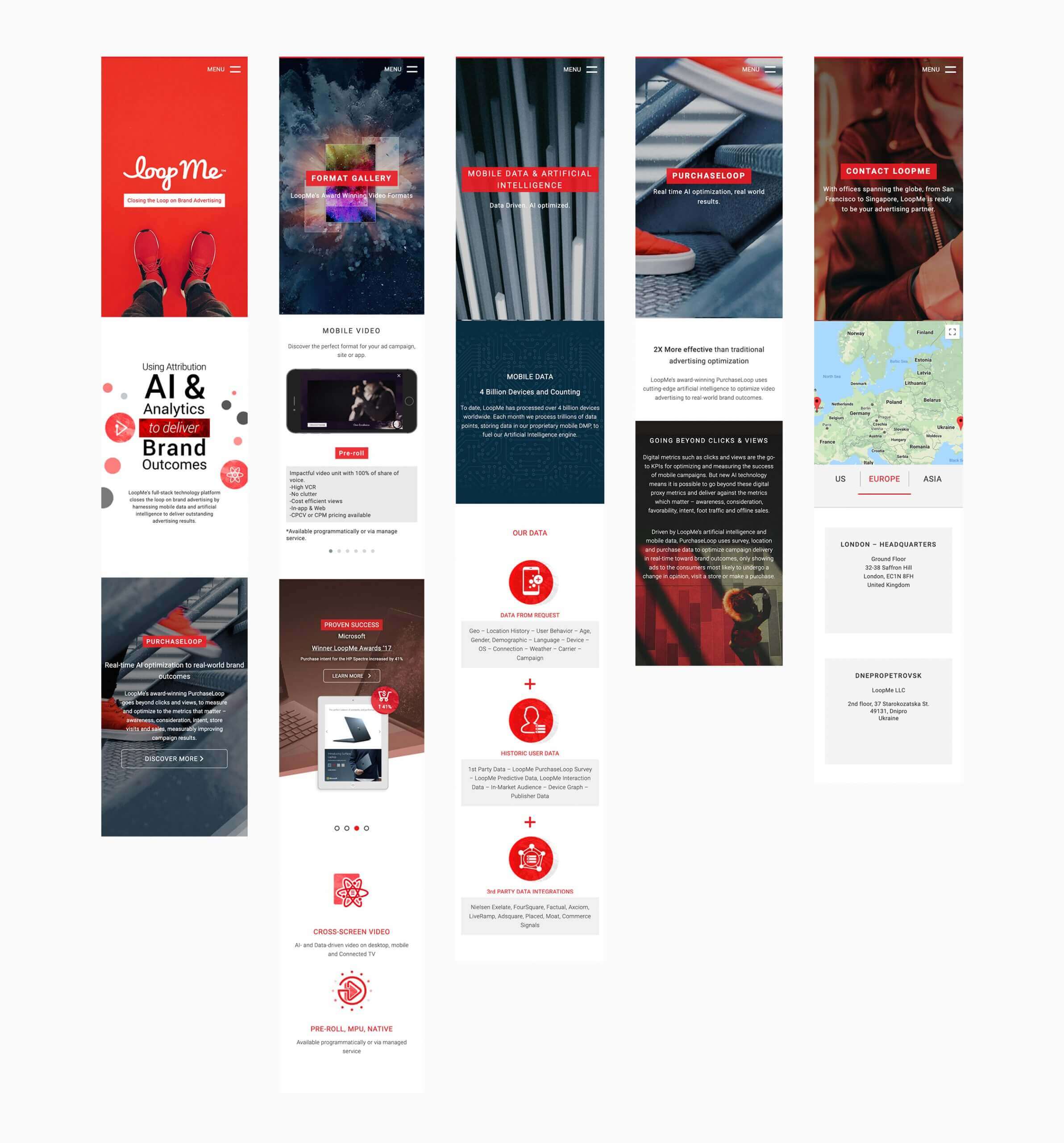
Desktop & mobile UI
As already stated my involvement in the design of the website’s user interface and graphics was only peripheral. However, I decided to include an account of these aspects here to round out the narrative of the project.
The user interface and graphics of the website were designed primarily for desktop browsers (Desktop first). From the initial research and based on our own logical conclusions, the primary user is accessing the website in a workplace and most likely using a laptop or a desktop computer.
Notwithstanding the website has also been optimized for mobile – functions or parts that are too complex to display on mobile have been omitted where this does not impair the functioning of the site.
An external development team worked on the development and SEO optimization through a proprietary CMS platform, which gives the marketing team the flexibility to update the blog and news sections.
Final thoughts
This project underscores the effectiveness of a user-centered, research-driven approach in delivering enhanced usability and experience. By focusing on collaboration and continuous improvement, LoopMe’s redesigned website is poised to meet client needs more effectively and strengthen its position in the advertising market.