
Airline App Study
Airline App Study
UX Design Institute of Dublin
Overview
I ran this project as part of my UX design postgraduate course at the UX Design Institute of Dublin. The project focused on the research, wireframe and prototyping phases of a new app for an airline company.
My role
User Research, User Testing, Wireframing, Prototyping
Course timeframe: 6 months
Why research is important
The research that precedes the design phase of a piece of software (and of any product in general) establishes the foundations of all subsequent phases of the process. Without initial research, it is impossible to objectively establish product specifications, both with respect to the market and end users. Failing to do this foundational research can lead the designer to fall into the trap of thinking that their own opinions, beliefs or needs are the same as those of the intended end user.
Finding established conventions
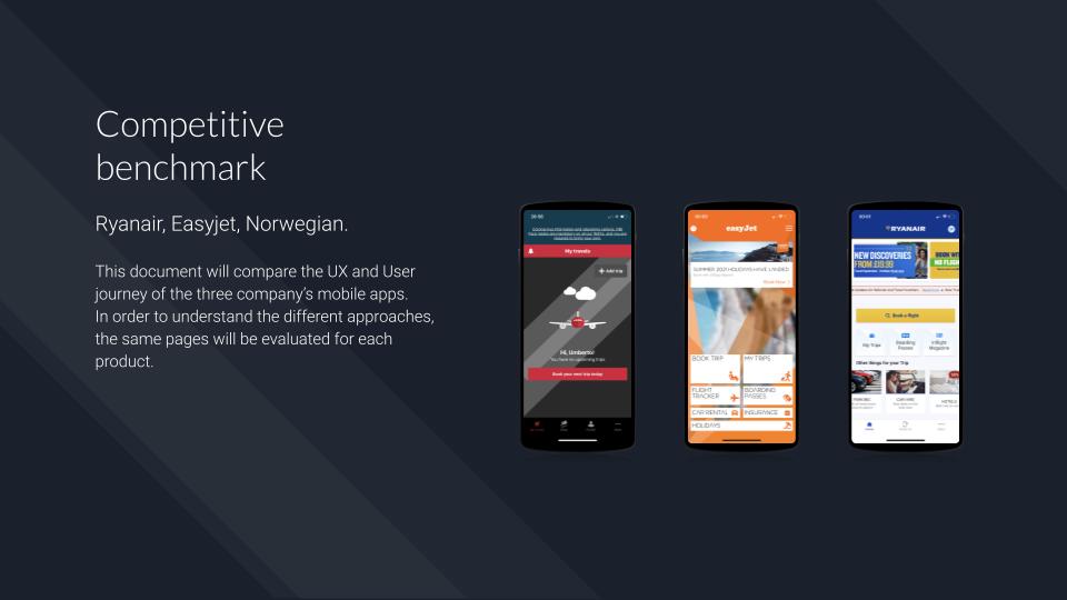
The first research phase involved competitive benchmarking.
Whether you’re launching a new product or optimising an existing one, establishing how the market has already solved some of the problems your software aims to address is important in order to avoid mistakes and pitfalls already made by competitors, and to optimise winning tactics that have already been successfully applied elsewhere.
The Competitive benchmarking phase is based on a theoretical judgment: competitors’ approaches are analysed based on established UX rules, without actually testing whether or not they will work for the specific product in question. This testing will happen later during the user testing phase.
Outcome
In the competitive benchmark I looked at three airline apps: Ryanair, Easyjet and Norwegian. I purposely mixed low cost airlines with other airlines geared towards more expensive flights in order to evaluate every possible approach.
From the benchmark comparison it emerged that low cost airlines have better apps than non-low cost competitors. In this case, Easyjet and Ryanair both optimise their home pages for a range of user needs that go beyond simply purchasing a ticket, while Norwegian’s home page is almost empty. In addition, Ryanair offers a quick view of flight prices for the day before and after the date selected as well as an optimized booking calendar. None of these functions are featured on Norwegian’s app.
Browse the competitive benchmark below, alternatively use the following link: Airline Apps Competitive Benchmark
Learning
During this phase of the research I discovered that it can be useful to run a competitive benchmark on products whose functions diverge somewhat from the product that is being developed. Benchmarking similar (rather than completely identical) products can often yield interesting insights.
In this case I found it useful to analyse airline apps with different target users in relation to budget. I also took into consideration flight aggregators ( such as Kayak ) to garner a broader view of calendar functions.
Testing the competitors
While the competitive benchmark was based on a theoretical analysis, user testing was the ultimate yardstick for validating the decisions made applied to the two specific apps. I tested the Ryanair and Norwegian apps on a total of three participants face to face. These are the three most important conclusions I drew from this testing:
- In both apps, Ryanair and Norwegian, the size and weight of the luggage included in the selected fare are not clear.
- The horizontal calendar showing prices in the preceding and following days is highly appreciated by the participants of the test.
- Saving passenger details for future use is generally appreciated by the participants.
- The Extras page is perceived as advertising rather than an integral part of the app.
See the user testing script here: Airline User Testing Script
An example of a user testing can be found below, see here the related note taking: Airline Note taking
Learning
In this phase of the research I learned the importance of preparing a good testing script for use during the initial interview and and also for guiding participants through the subsequent tasks.
The book The Mom Test, by Rob Fitzpatrick helped me to avoid using any leading questions as I carried out the user testing, and also to focus on participants’ everyday experiences rather than their personal opinions during the interviews.
Convergent research
After reviewing and transcribing all the information gathered during the user testing, each issue or appreciation was summarised in a short sentence. These phrases were distributed in an affinity diagram using Miro, in order to visualise the problems the user encounters while navigating the app.
At first we used a natural grouping approach; later on we gave each group a meaningful label to use for the customer journey mapping phase.
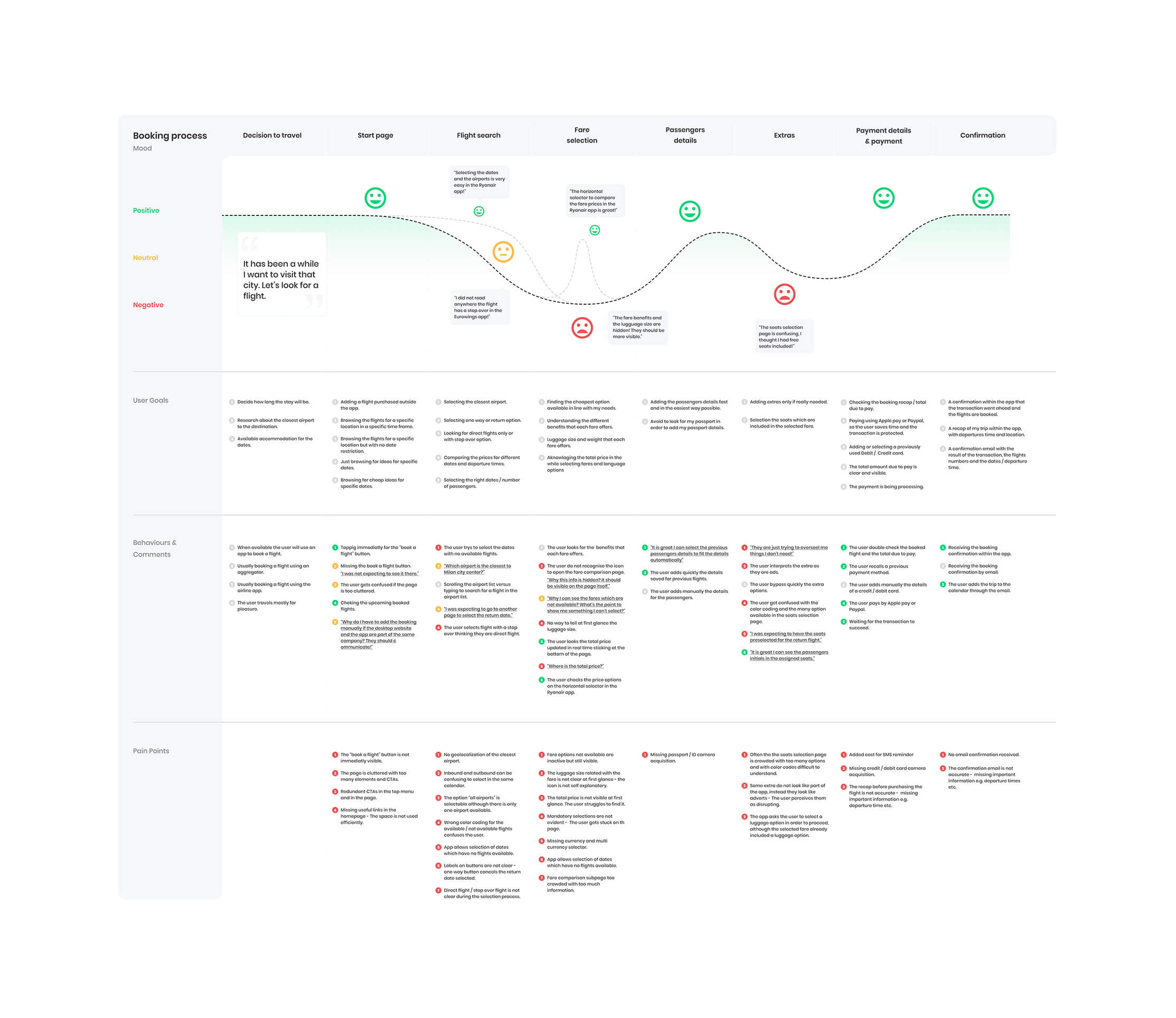
User journey map
I designed the user journey map in order to analyse the user’s path right from the login process to the flight purchase confirmation. No other alternative routes have been considered in this map.
I divided the map into four different sections: mood curve, user goals, behaviors & comments and pain points.
- Mood curve: I drew a main curve to represent the user’s usual emotional response. Two secondary curves display extraordinary situations encountered in specific apps. Adding extras to a trip after having selected a fair appeared to lead to the most jarring experience for users.
- User goals: This section describes what the user is looking for during the booking process, in order of importance
- Behaviors & comments: In this section I highlighted any unexpected behaviors by the user. The main problems arise when the user tries to select a direct flight and then they find out the selection has a stop over. Confusion also appeared to arise in users when it came to selection luggage options.
- Pain points: in this section I listed the problems that led to unexpected user behaviors.
I have also noted all of the users’ positive comments in the user journey map, so they can be taken into account in the subsequent phases.
See the user journey map below for a quick overview, alternatively open the Figma file: Airline Customer Journey Map
Learning
In the customer journey map it is important to highlight both positive and negative findings. By focusing only on the pain points, there is a risk of overlooking the optimisations already carried out by the competitors, which can actually prove a source of inspiration in the subsequent design phases.
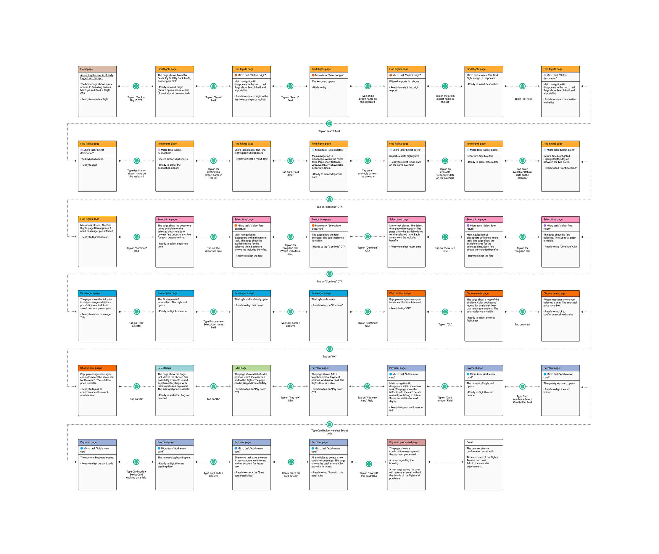
The purchase flow
Designing the flow diagram I focused on the use of microtasks. I split the flight purchase journey into five main pages: flight search, time selection, passenger data, seat selection and payment.
Fare selection and luggage selection take place within “in-page components”. This approach helps the user to focus on steps in well-grouped chunks.
See the flow diagram below for a quick overview, alternatively open the Figma file: Airline App Flow Diagram
Lo-fi wireframe & prototyping
I sketched a first draft of the app, based on the flow diagram I had previously created. As already mentioned, I used an approach based on micro tasks, in order to group all the steps of the purchase in the fewest possible pages.
I designed the lo-fi wireframe in Figma using a graphics tablet. I prefer the graphic tablet over paper even for the first sketches; in this way I can simply clone and reuse elements as I need them.
After the first sketch, I built a medium fidelity prototype with Axure in order to test the entire purchase flow with some users for validation purposes. Although the prototype does not have a definitive design, it has an advanced logic system, such as the calculation of the total price in real time, and a global variable system which adjusts each page in accordance with the data submitted on the account-creation page.
Browse the lo-fi wireframe at the following link: Airline App lo-fi Wireframe
Test the prototype below, alternatively use the following link: Airline App Axure Prototype
Prototype available on desktop only
Learning
This phase of the project gave me the opportunity to start learning Axure.
Although the course required a mid-level fidelity prototype, I decided to start the project using Axure, which allows for granular precision when it comes to prototype fidelity. I learnt how to use global and local variables, and logics which guide the user along an established path, while still giving them the feeling of being able to make choices. With this prototype I focused more on the backend settings and front-end behavioral fidelity, rather than focusing on the graphics.
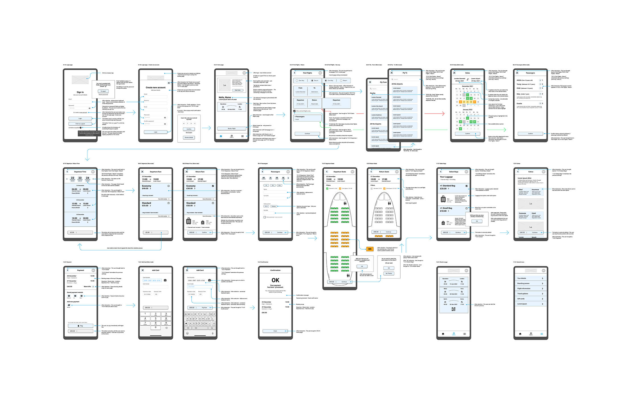
Wireframing & notes
I reworked the high fidelity wireframe using the lo-fi wireframe I had already created and the prototype in Axure as springboards. I used Figma, both for the design of the pages and for the annotations to attach to the wireframe. All of this would be later delivered to the UI designers and developers.
In the annotations I described each user’s interaction with the software in detail, as well as the software’s corresponding reactions, so as not to leave any doubt for the developers. I focused on the requirements in the validation process for emails and data fields; on the mandatory steps to be completed before proceeding to the following pages; and on the positioning of the interface elements.
I did not want to describe in detail elements such as font size, interface colors or specific icons – this part would be left to the UI designers.
See the HI-FI wireframes below for a quick overview, alternatively open the Figma file: Airline App hi-fi Wireframe
Learning
In this phase of the project I learned that annotations attached to the wireframe have at least 50% of the value of the wireframe itself. Without annotations, UI designers and developers may have to solve problems that the UX designer has already recognised and addressed during the research process.
Results & takeaways
This course has given me a great foundation to start experimenting with user experience research during my next projects.
The results I obtained at the conclusion of these six months were excellent. I consider this experience a starting point in my journey and not the final destination in my study of the user experience. The stack of books on UX research on my bedside table is only getting higher and higher!