
Starbucks EMEA: Continuous UX Optimisation at Scale
Continuous UX Optimisation at Scale
Starbucks EMEA
Executive summary
The ongoing project focuses on enhancing the Starbucks app for the EMEA region by refining the current patters and introducing new functionalities. This initiative is grounded in comprehensive research tailored to our target audience, competitive landscape, and overarching business objectives. The project encompasses a series of iterative steps involving the identification, design, implementation, and rigorous testing of new features. Central to our approach is a commitment to continuous improvement, leveraging real-time data and user feedback to refine the app’s performance and user experience continuously.
Over two years, the app has seen a 25% improvement in both user retention and task completion rates, highlighting the success of our user-focused, data-driven approach in enhancing functionality and meeting customer needs.
My role
Lead UX for Starbucks EMEA, Workflow ownership, Data analysis, A/B testing plan collaboration, UX patterns consistency across the ecosystem
Timeframe: Ongoing project
Background
Starbucks, a global leader in the coffeehouse industry, is known for its commitment to providing premium coffee and a personalized customer experience. The Starbucks app, available on both Android and Apple platforms, serves as a digital gateway for customers to order and pay for their favorite food and beverage items conveniently. This app is integral to enhancing customer engagement, offering unique features such as loyalty rewards, customizable orders, and location-based services, ensuring a seamless and interactive user experience across both mobile ecosystems.
The team
The core team typically consists of several Senior UX Researchers & Designers and UI Designers, adept at handling routine design and interface tasks adeptly across projects. During periods of high demand, such as major app updates or new feature rollouts, the team structure dynamically expands.
Workflow
We implemented a structured workflow for the Starbucks app to enhance efficiency across design and development cycles. This setup accelerates familiarization with project tasks, reduces resource needs, and ensures quality through defined checkpoints and reviews, maintaining consistency across updates and feature rollouts.
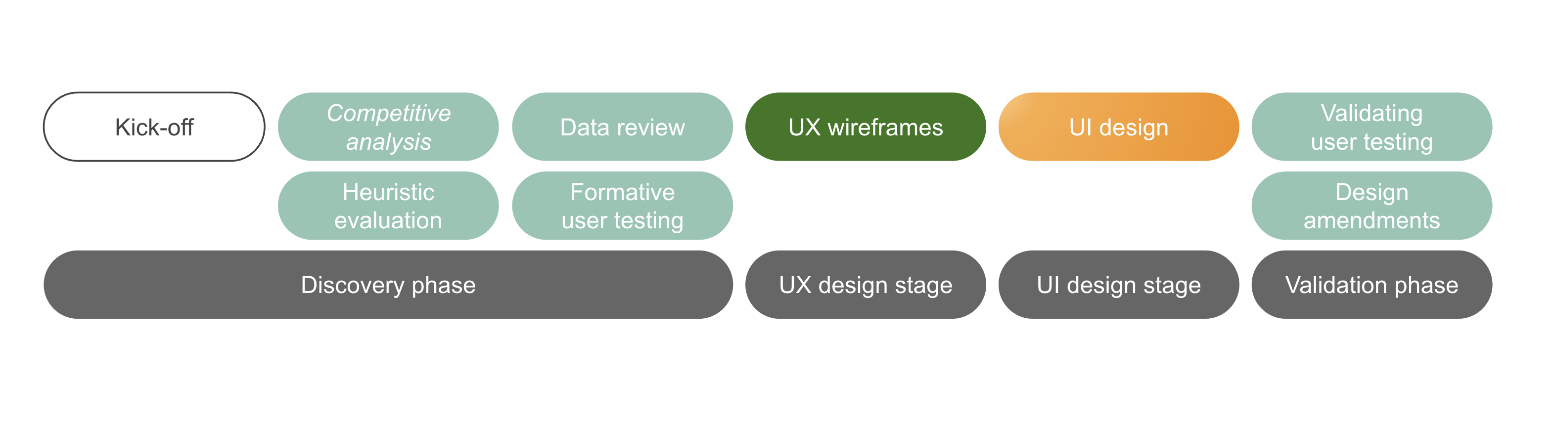
Project case study
To demonstrate the classic cycle of our improvement workflow, we will present a detailed case study of a single improvement project, showcasing all its stages. This approach will illustrate each step in the workflow from initiation to completion, providing a clear view of the processes and methodologies applied throughout the project.
Product detail page improvement
Starbucks expressed concerns about usability and progression rates on the product detail page. In collaboration, we analyzed existing data to validate these concerns. Using insights from this analysis, we established specific goals and KPIs for a detailed UX improvement cycle. This cycle will begin with an extensive research phase, utilizing both qualitative and quantitative methods to fully understand user interaction issues and drive targeted enhancements. This approach ensures our improvements are grounded in factual user behavior and aligned with Starbucks’ strategic objectives.
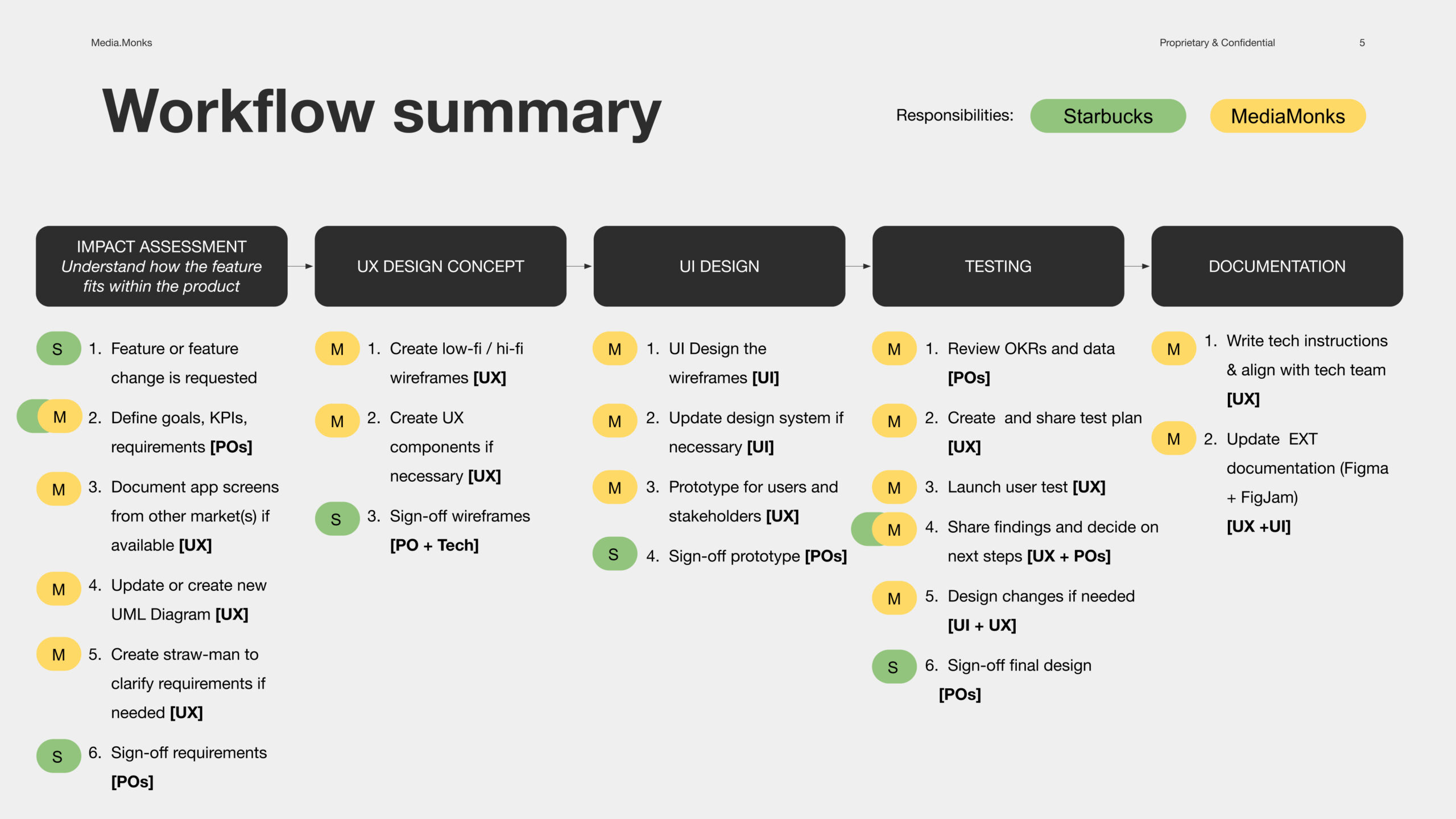
UX plan
A UX plan is vital in app improvement cycles as it ensures every aspect of the workflow is addressed systematically.
- Goals and KPIs
- Competitive benchmark and heuristic evaluation
- Data review
- Formative user testing
- Wireframing and documentation
- Validating user testing and design amendments
Competitive analysis
A competitive analysis involves assessing similar features in rival apps to identify strengths and weaknesses, guiding enhancements on the Starbucks app’s product detail page to ensure it outperforms competitors and meets user expectations more effectively.
- Price Visibility on PDP: Prices on the Product Detail Page (PDP) are always visible and update during product customization.
- Use of Iconography: Brands with fewer customizations often use iconography; specifically, iconography by category can be tested.
- Customization Display: Customizations are usually displayed on the same screen and organized by category, unlike Starbucks US where only the most commonly used customizations are prioritized (A/B testing recommended).
- Calorie Information by Nero: Nero specifically provides calorie information per customization.
Browse the competitive analysis below, alternatively use the following link: Starbucks PDP competitive analysis
Heuristic evaluation
An heuristic evaluation is a method where usability experts review a product’s interface against established usability principles to identify issues. For the Starbucks app’s product detail page, we conducted this evaluation using Gestalt’s Principles and Nielsen-Norman heuristics, thoroughly analyzing the page to pinpoint usability flaws and optimize the layout and functionality for a better user experience.
- Visual Cues: The PDP lacks visual cues for customizations and customized items.
- Information Clutter: Nutritional information and allergens clutter the screen, causing cognitive load.
- Redundant Interactions: The PDP requires unnecessary user interactions to proceed through the purchase funnel.
- Design Issues: Proximity and pattern issues (e.g., placement of the reset CTA).
Browse the heuristic evaluation below, alternatively use the following link: Starbucks PDP heuristic evaluation
Data review
To analyze the performance of the Starbucks app’s product detail page, we reviewed data focusing on:
- Engagement to Purchase: Examined how engagement on the PDP correlates with transaction completions.
- Customization Impact on Order Value and Conversion: Analyzed how product customizations impact average order values and conversion rates.
- Customization Usage and Reset Engagement: Identified the most frequently used customization attributes and evaluated user interaction with the reset feature.
Formative user testing
User testing involves several main steps:
- Defining Research Objectives: Establishing clear goals that the questions and tasks will address.
- Developing a User Testing Plan: Outlining the methodology, participant criteria, scenarios, and questions that will guide the testing process.
Only the most critical findings from the user testing are summarized below:
- Price Addition: Identified the need for clearer display of price changes when customizations are made.
- Priority on Most Used Customizations: Emphasized the benefits of prioritizing frequently used customization options to boost PDP usability.
- Page Chunking Division: Recommendations to improve the segmentation of information to enhance readability and navigation.
- Customizations Selectors Improvement: Suggestions to refine the selectors for a more intuitive user experience.
Browse the user testing plan here: PDP User Testing Plan
Learning
After completing research triangulation, it is important to group all the findings and prioritize them based on the potential return on investment. One effective approach is to create a table of opportunities that identifies each finding and quotes the level of effort required for implementation. Then, each finding can be evaluated based on its potential return on investment, considering both immediate gains and long-term benefits.
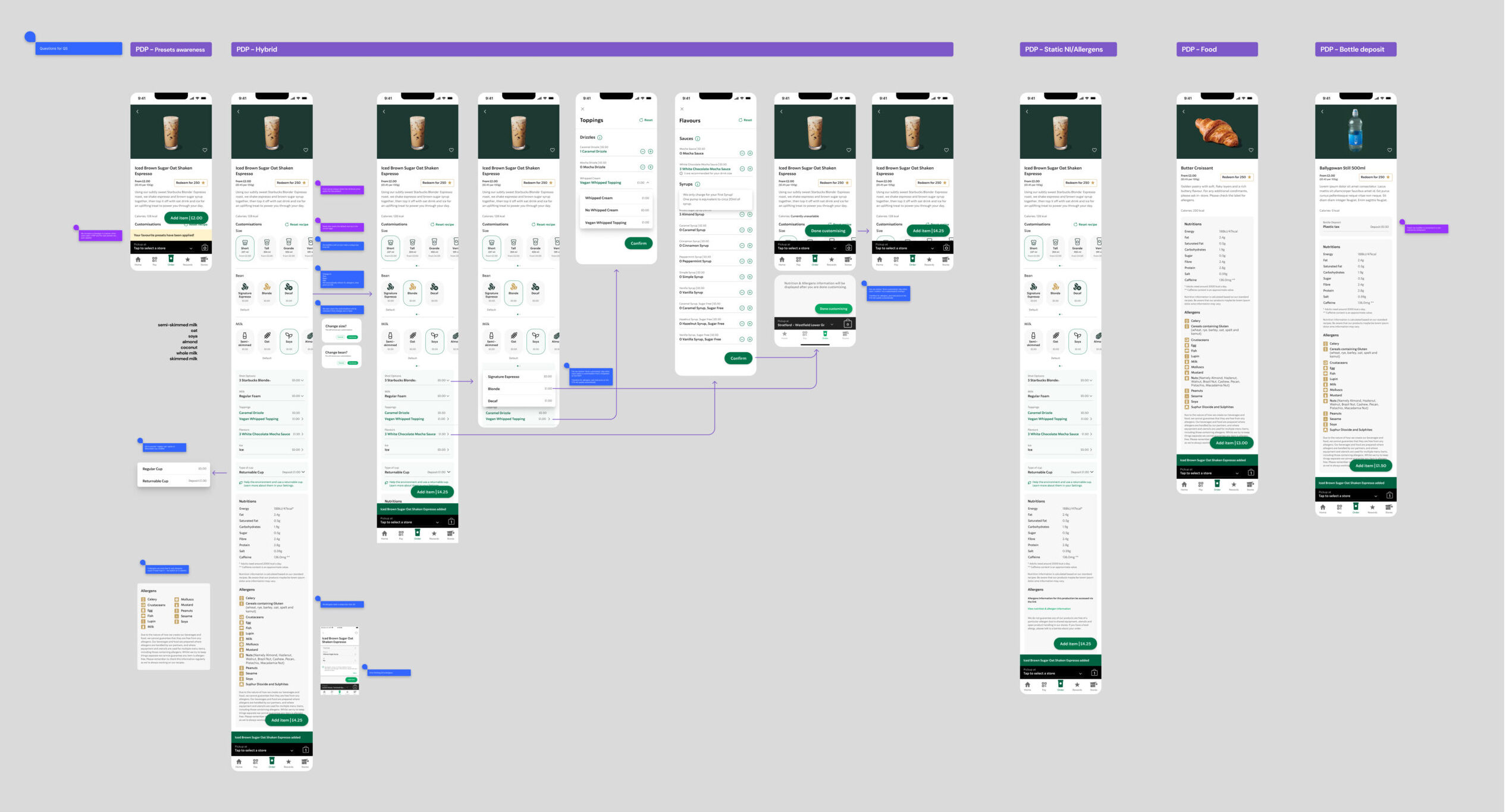
Wireframing
To develop wireframes for the Starbucks app’s product detail page, we closely analyzed the existing interaction patterns within the current app. This analysis helped identify areas requiring enhancements. For elements of the PDP that remained unchanged, we reused existing high-fidelity UX frames. Conversely, for sections of the PDP where we introduced new interaction patterns to improve usability, we employed low-fidelity frames. This approach enabled us to clearly distinguish between established and newly designed aspects, ensuring a focused developmental effort on necessary enhancements.
Improvements Include:
- Visual Enhancement of Selectors: Introduced more engaging and visually appealing selectors for frequently used customizations.
- Content Grouping: Segregated interactive areas from readable content to streamline user interactions and enhance content digestibility.
- Price Addition: Ensured the addition of clear pricing information both for the base product and any customizations, enhancing transparency and decision-making ease for users.
See the wireframes below for a quick overview, alternatively open the Figma file: PDP optimisation.
Design
The UI team applied the existing design system to new interaction patterns for the Starbucks app’s product detail page, updating it to include new components. They then created a prototype with these updates, which was used in a final round of user testing to validate the enhancements and ensure they met user expectations effectively.
Final thoughts
This project highlights the power of a user-centered, data-driven approach in achieving measurable results. By prioritising continuous refinement, the Starbucks app is well-positioned to exceed customer expectations and drive long-term success in the EMEA market.