
Aspiring Minds – Skills Assessment App
Skills Assessment App
Aspiring Minds
Executive summary
I was engaged by Aspiring Minds to perform a comprehensive analysis of the AMCAT app following its recent acquisition from a third party company, focusing on identifying pain points and improvement areas. The project involved user research, wireframing, and interface design performed by their internal team over three weeks, alongside a competitive benchmark analysis of similar apps like Pymetrics and HireVue.
Key findings from user testing with seven participants highlighted issues such as a lack of clarity in the interface, unexpected access requests, and confusion regarding the assessment timer. In response, various enhancements were implemented, including a welcome video introduction and a simplified user interface.
These optimisations resulted in a 25% improvement in task completion rates, significantly enhancing the AMCAT app’s overall user experience. The design system created during this project will support future iterations and ongoing improvements.
My role
User research, Wireframing, Interface design
Timeframe: 3 weeks
Background
AMCAT is a remote assessment app by Aspiring Minds, a global job skills assessment company. The app behaves as a media for different typologies of tests, including multiple choice questionnaires and asynchronous video interviews. Learn more about AMCAT.
A solo UX designer project
The company that acquired the AMCAT app asked me to temporarily join the AspiringMinds UX design team to give them a fresh perspective during the optimisation process.
For this reason, and in order to avoid any bias, I carried out the user research and wireframing independently.
The project map below shows the fork after the research phase and partially reconnecting during the design system phase.

Understanding the software
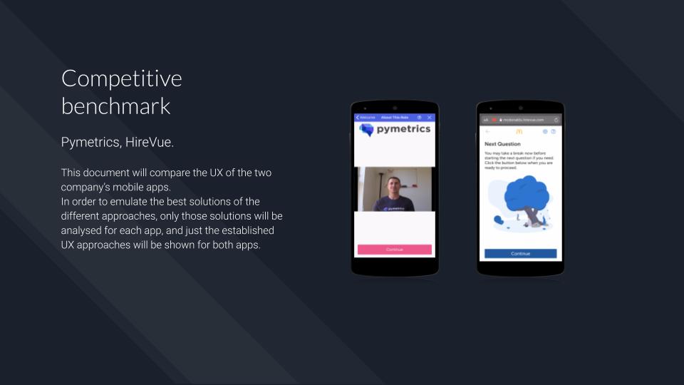
I had never used a job assessment app before. The best way to understand how the software worked (or how it should work) was to start the research with a competitive benchmark.
With the help of the Aspiring Minds team I identified two competitors that had the same type of software: Pymetrics and HireVue.
Competitive analysis & heuristics
Due to an access issue, I had to run the competitive benchmark before I had a chance to analyse AMCAT. The app required bespoke credentials in order to start the assessment process, and the client could only provide them to me the day after the project started.
Here are some established strategies and heuristics I identified in the competitors’ apps, which I later validated during user testing:
- Video introduction done by a real person: this seems to help create a friendly and less automated atmosphere before the interview.
- Data Consumption: Pymetrics and HireVue warn the user immediately about the data consumption.
- Time needed to perform the assessment: the time the user requires to complete the assessment is always communicated before starting the interview and assessment process in order to allow the user to postpone the task if necessary.
- Access to camera and microphone: both apps ask the user to consent to camera and microphone access for the duration of testing only.
Browse the competitive benchmark below, alternatively open the following link: AMCAT Competitive Benchmark
Learning
Due to technical problems, I had to carry out a competitive analysis before studying the product itself. At this stage I began to consider whether or not f I should make this pattern the default one.
By first studying the product on which the research is going to be applied, you often come in contact with the design team, who unconsciously “sell” the product to you. Starting with the market analysis first could prevent the development of any cognitive bias.
User testing with a wide range of users
Looking for candidates for user testing seemed simple at first but later became difficult. Although the target user is any person looking for a new job, no one I contacted had any experience with this type of application before. Even though this was not a mandatory prerequisite for participating in the test, I would have liked to include this variable in the research.
I therefore decided to modify the user testing part of my usual interview script creating a fork in case the participant had previous experience with a remote assessment app.
View the user testing script at this link: AMCAT User Testing Script
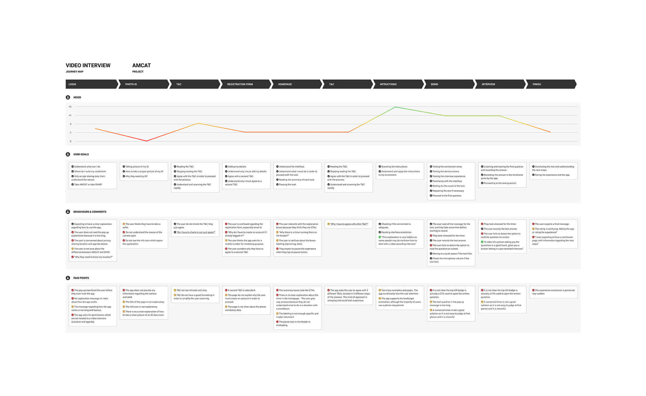
User testing outcome
I tested the app on seven participants. None of the participants had ever used a remote assessment app before, but all of them had previously used a video calling app ( FaceTime, WhatsApp, Skype etc) so I decided to use this alternative to gather information about mental models.
The AMCAT app works as follows:
The user accesses the app via a personal invitation. Next they follow a series of assessments in consequential order. The first tasks are multiple choice questions or numerical answers. The last task is an asynchronous video interview.
The main problems encountered by the participants were the following:
- Lack of a clear interface: any page required different tooltips to explain to the user both how to interact with the page or to clarify the purpose of the page itself.
- Requests for access permissions for no apparent reason: the app unexpectedly asked the user for permission to access the user’s smartphone’s microphone and camera without giving any explanation for the reason.
- Lack of clarity about the timer: the assessment process involves answering a series of questions within a limited time frame. The user is not made aware of this procedure at the outset and the sudden appearance of the timer can cause the user confusion, apprehension or anxiety.
An example of a user testing can be found below. See here the related note taking: AMCAT Note taking
Convergent research
Because of the difficulty I had in finding users who had experience using this kind of app, I decided not to adopt a quantitative approach to my research (such as an online survey). Instead, I suggested implementing FullStory which would position me to be better able to evaluate future quantitative data.
The next step involved the development of personas.
Personas
I created three primary personas. While I have included some general descriptive characteristics in their descriptions, I have mainly focussed on elements that characterize the personas in the workplace, as these characteristics are the most pertinent to the app’s function.
These personas have helped me to not to lose sight of who the software is designed fo (and will they will no doubt serve as a continuing reminder for Aspiring Minds into the future as well)
- Persona 1, Kevin: Kevin is a young graduate with a Master’s degree in financial management working a part-time job at a university while he looks for a permanent position in the finance industry. (AMCAT not only provides job assessments for subjects who want to change careers but also for newly graduated subjects who are about to find their first job).
- Persona 2, Marie: Marie is a mother who works in a corporate charity. She is often busy outside her working hours and even if she would like to change her working environment, she doesn’t have much time for it (I wanted to include the element of disability in the creation of the personas, as the application needs to be AA compliant).
- Persona 3, Charles: Charles is a professional leather worker with thirty years of experience in his industry. He earns high wages high in an extremely niche industry. He would like to change company and get involved in mentoring young artists in the leather field – (I wanted to insert the element of professional seniority, to emphasize that AMCAT must not be designed only for “first job users”)
These personas summarise the AMCAT app users main goals and needs.
Browse the three personas below, alternatively open the following link: AMCAT Personas


Learning
It can be easy to fall into the trap of thinking that the more personas you invent to optimise a product, the better the result. This is wrong. Even if an app or website must be designed for an extremely wide range of users the best approach is to optimise it for the most likely ones.
“If we identify three primary personas, we will end up designing three interfaces. If we identify four primary personas, we know that we have a big problem – Alan Cooper”
User journey maps
I created a user journey map using the findings that emerged during user testing.
The client asked me to omit assessment of the multiple choice and numerical tasks at this stage of my research.
These parts of the assessment are to be redesigned separately as part of a larger project involving the desktop platform.
The app’s former interface and user flow can be viewed at this link: AMCAT Current Flow
See the user journey map below for a quick overview, alternatively open the Figma file: AMCAT Customer Journey Map
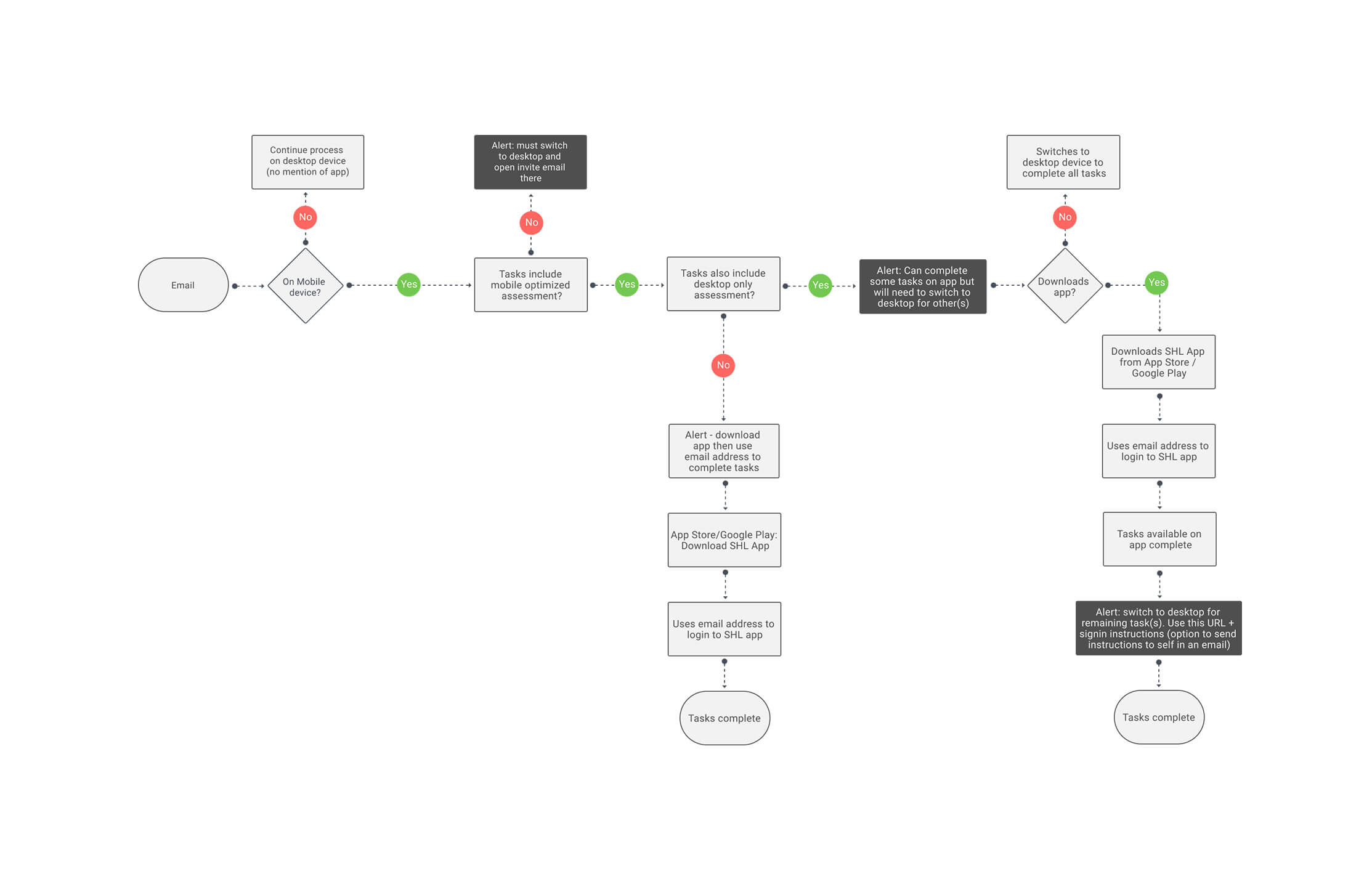
A mixed flow between mobile and desktop
The AMCAT app is part of a larger assessment system. The assessment partly takes place on a mobile device and partly on a desktop computer. For this reason the user could start the journey on mobile and end it on the desktop, and vice versa.
In the current version of the app (which was developed during UX/UI sprint) the user starts and ends the assessment on the mobile device. In this case the mixed-flow journey does not apply.
The new high level user flow will be implemented in the next version of the app, and includes a series of alerts that warn the user if the assessment needs to be saved and finished later on another device.
See the flow diagram below for a quick overview, alternatively open the Figma file: AMCAT Flow Diagram
Learning
In this case it was necessary to describe different levels of user flows. As already mentioned, the AMCAT app will be integrated into a larger assessment system involving a desktop platform. For this reason I believe it is good practice to divide the user flow into external and internal levels.
The external flow describes how the app integrates into the overall system, while the internal flow describes how the user interacts with the app.
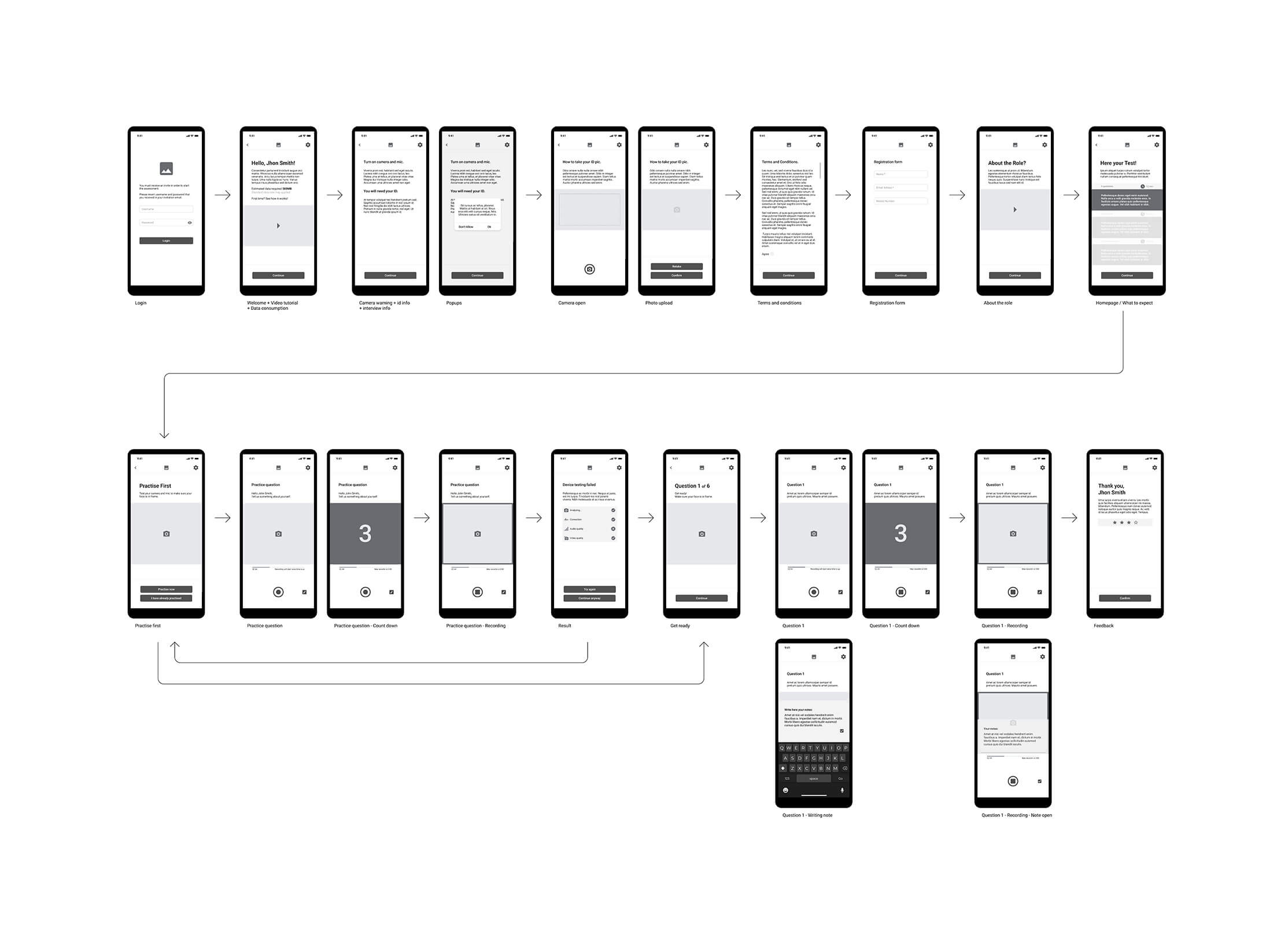
Internal user flow
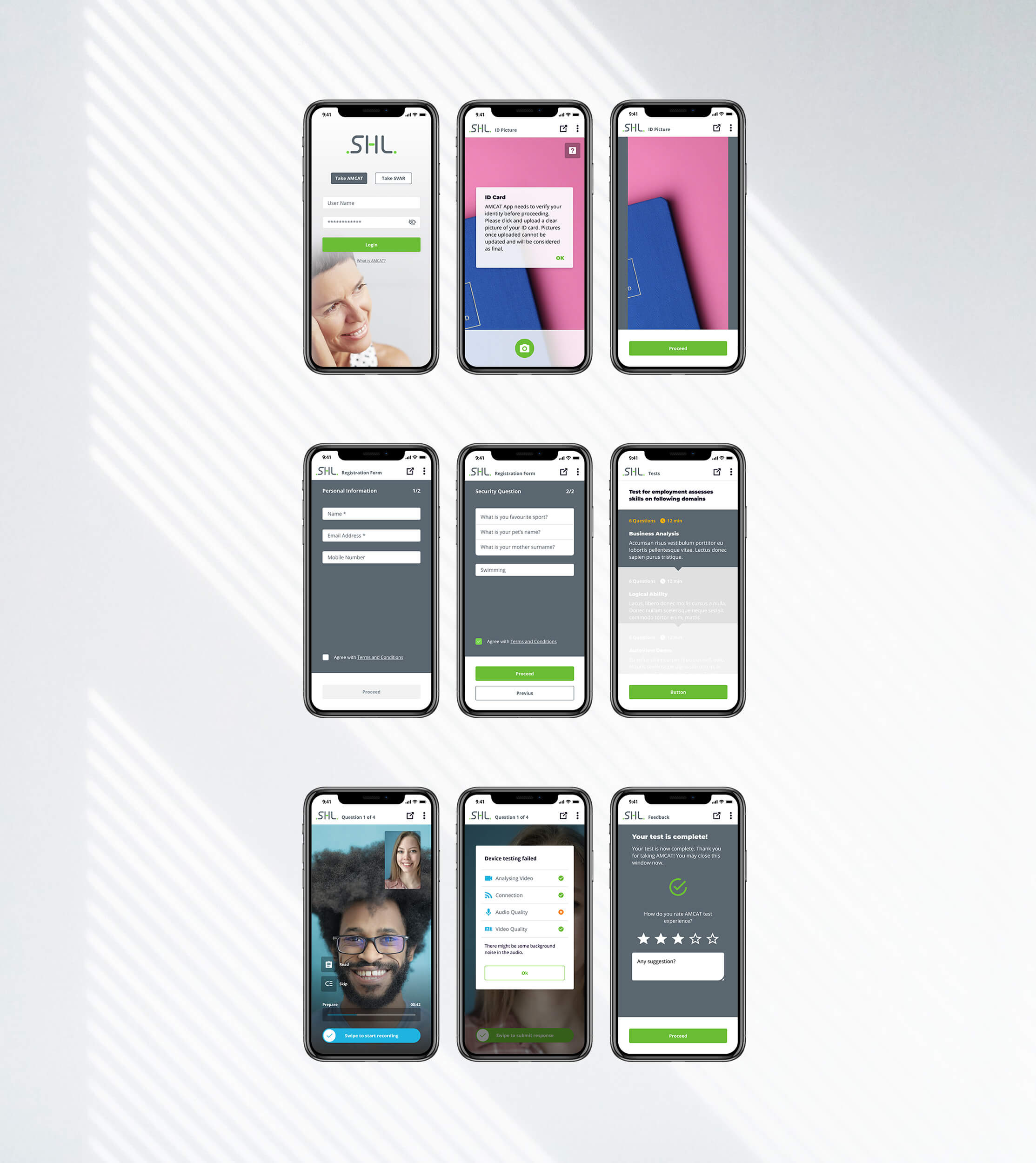
In this final phase, I created a flow that visualizes a redesigned “internal” user flow applied to a medium fidelity wireframe.
Using the data collected during the research, I redesigned AMCAT by eliminating the redundant parts and adding those elements of the UX that proved to be established conventions.
The main optimizations are listed below:
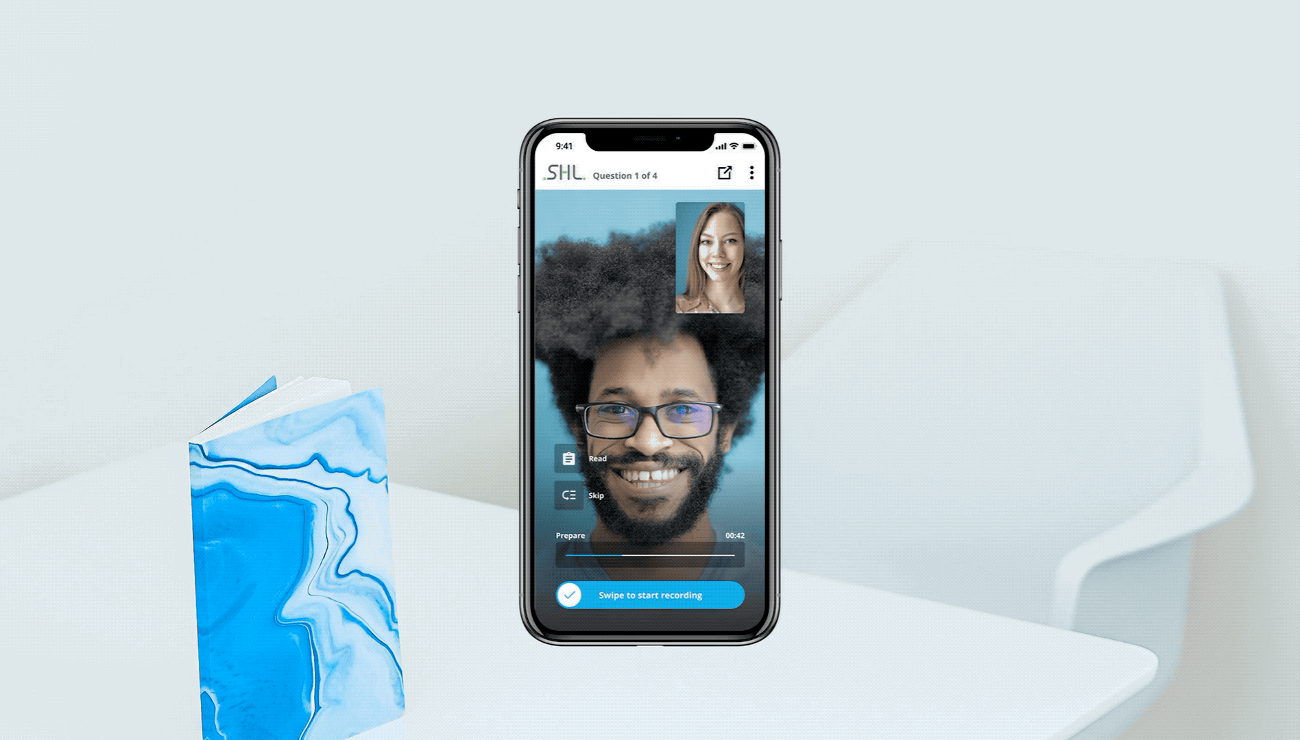
- Welcome message: immediately after the login page, I designed a welcome page with a video (that preferably features a real person) that welcomes the user underlining the data consumption and introducing the app functionalities.
- Camera / mic / ID warning page: a new welcome page makes the app’s functionalities more apparent upfront. The page advises the user that he or she will be soon asked to authorize the use of the microphone and the camera. The user is also advised to have an ID document ready for the next step.
- T&C page: I have proposed a unified page for terms and conditions, with dynamic code that changes depending on the type of assessment (I have also proposed a page that changes depending on the type of user – this suggestion is set to be discussed by the company’s legal team)
- Homepage: I proposed the elimination of the timer on this specific page. I also created a draft interface that suggests to the user how tasks must be completed in progression.
- Simplification of the user interface: in the asynchronous video interview part, I minimized the user interface so as not to confuse the user during the interview.
- Addition of the “take notes” functionality: I proposed this function in order to allow the user to take notes during the video question. The user can open these notes while recording his or her response.
- Written question always visible: I stressed the importance of keeping the text of the questions always visible on the screen, even during the phase of recording the answer. This helps the user understand and remember the question even in noisy or distracting environments.
Early LO-FI wireframe here: AMCAT New LO-FI Wireframe
See the flow diagrams below for a quick overview, alternatively open the Figma file: AMCAT Wireframes
UX sprint & revamp
The client asked me not only to optimize the UX of the overall app but also to run a UX sprint in order to improve the experience with minimum effort in terms of development for an early release.
I decided to apply the MVP concept even though this is usually applied to products when they are launched on the market. I shared a long list of possible changes with the development team and asked the team to quote how much time would be needed to implement each change for the app. In the meantime I established a list of UX priorities to be applied immediately to the app.
These priorities are as follows:
- Consent requests: minimize consent pop-ups, keep consent notifications only for camera and microphone use.
- Make information popup for the ID page immediately visible.
- T&C on the same page.
- Eliminate the timer on the homepage: research has shown that the timer on the homepage places high stress on users.
- General interface repositioning.
The app’s revamped interface and UX priorities can be viewed at the following link: AMCAT UX priorities & revamp
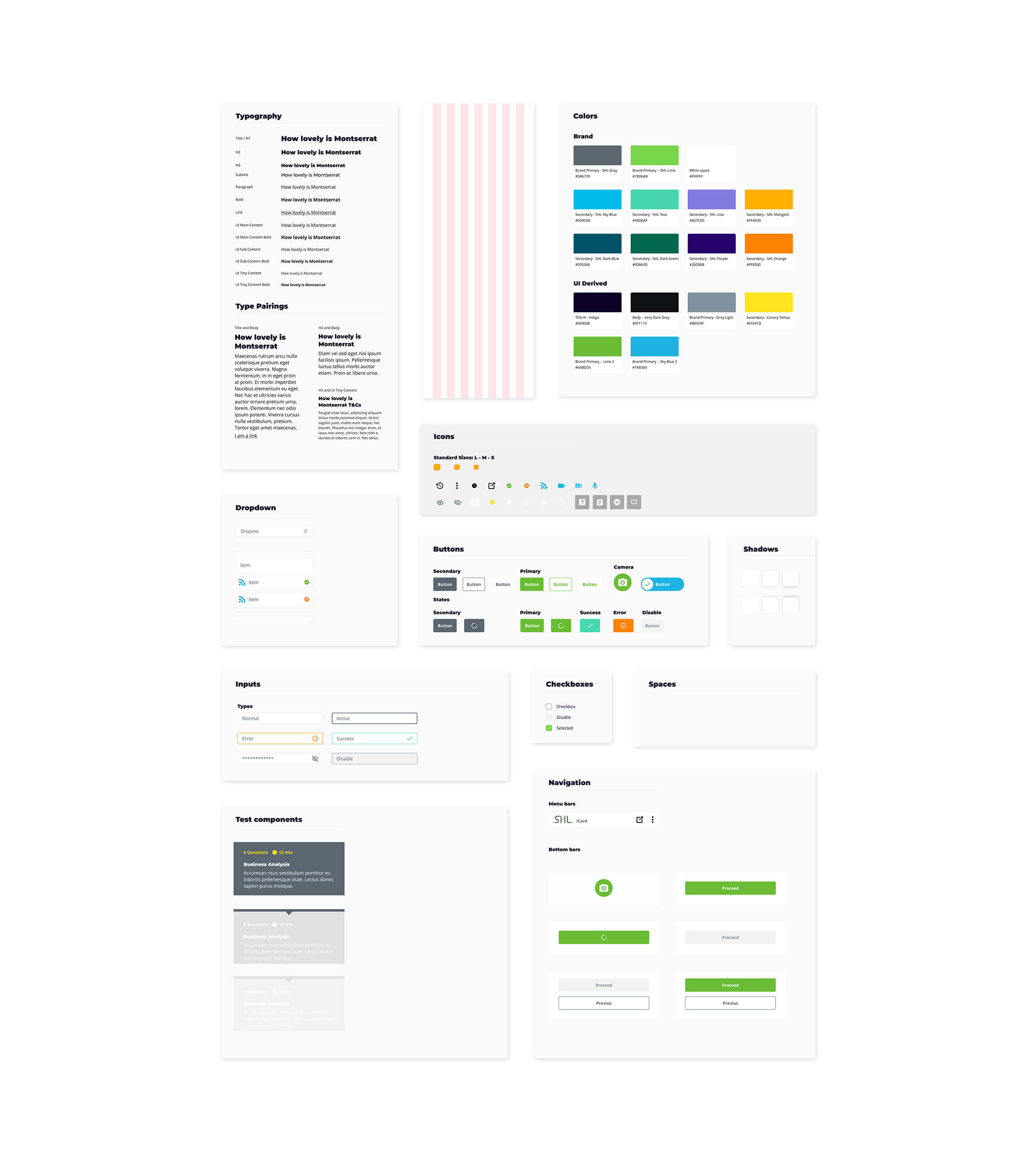
Design system
In line with the priorities identified above I applied a new UI in order to conform the app with the client’s brand guidelines.
Lastly, as the final phase of this project I created the beginning of a design system in Figma, which will be expanded in the future iterations of the app.
Final thoughts
This project highlighted the significance of a user-centric approach in improving the AMCAT app’s experience. By conducting thorough research and analysis, we identified key pain points and implemented targeted improvements that led to notable increases in user satisfaction and task completion rates. A key takeaway was the value of real user feedback in informing design decisions, emphasising the need for a continuous feedback loop for ongoing enhancements to the app.