
Upstix’s property valuation platform
Property valuation platform
Upstix
Overview
Upstix reached MediaMonks to refine its platform’s conversion funnel, placing a strong emphasis on a user-centric and data-driven approach. The primary objective of the project is to optimize the conversion rate (CRO), with improvements quantified through analytics in comparison to the baseline. MediaMonks conducted an in-depth analysis, integrating marketing benchmarks, heuristic evaluation, and user testing to successfully achieve this optimization.
My Role
UX plan, Conversion funnel analysis, Research, Wireframing, Validating & Testing
Timeframe: 5 weeks (Including UI design and validation)
Background
Upstix, with 25 years of experience in the UK residential property market, facilitates home buying and selling. Through its part exchange business, PXS, it has overseen 4,000 property transactions, exceeding £1 billion. Upstix offers final property offers within 48 hours, aiming for a 7-day sale turnaround as an iBuyer. To sell to Upstix, homeowners can get a free valuation within 24 hours, followed by an independent agent’s verification, and then complete the sale with fund transfer, only covering conveyancing fees.
Learn more about Upstix
A Design Team of Two
On this project, two UX designers collaborated, each with distinct focuses. I primarily concentrated on the conversion rate optimisation (CRO), specifically working on enhancing the conversion funnel from the homepage to the form submission process. Meanwhile, my colleague primarily directed efforts towards overall website optimisation, employing heuristic evaluation as a primary method.
Understanding the Problem
At the project’s outset, we organized a kickoff meeting with Upstix, where they expressed a commitment to improving the conversion rate. Emphasizing the data-driven nature of this endeavor, Upstix aimed to report these enhancements to investors. During the meeting, they flagged an unusual drop rate in specific form sections, providing analytics and heatmapping data for further analysis and improvement insights.
UX plan
After the kickoff meeting, I teamed up with MediaMonks to create a simple UX plan focused on improving Upstix’s conversion rate. The plan, based on data insights, outlined practical steps to enhance the user experience, specifically in the conversion funnel.
- Goals and KPIs
- Baseline
- Competitive benchmark and heuristic evaluation
- Informative user testing
- Wireframing and UI design
- Validation user testing
- Tracking plan
Baseline
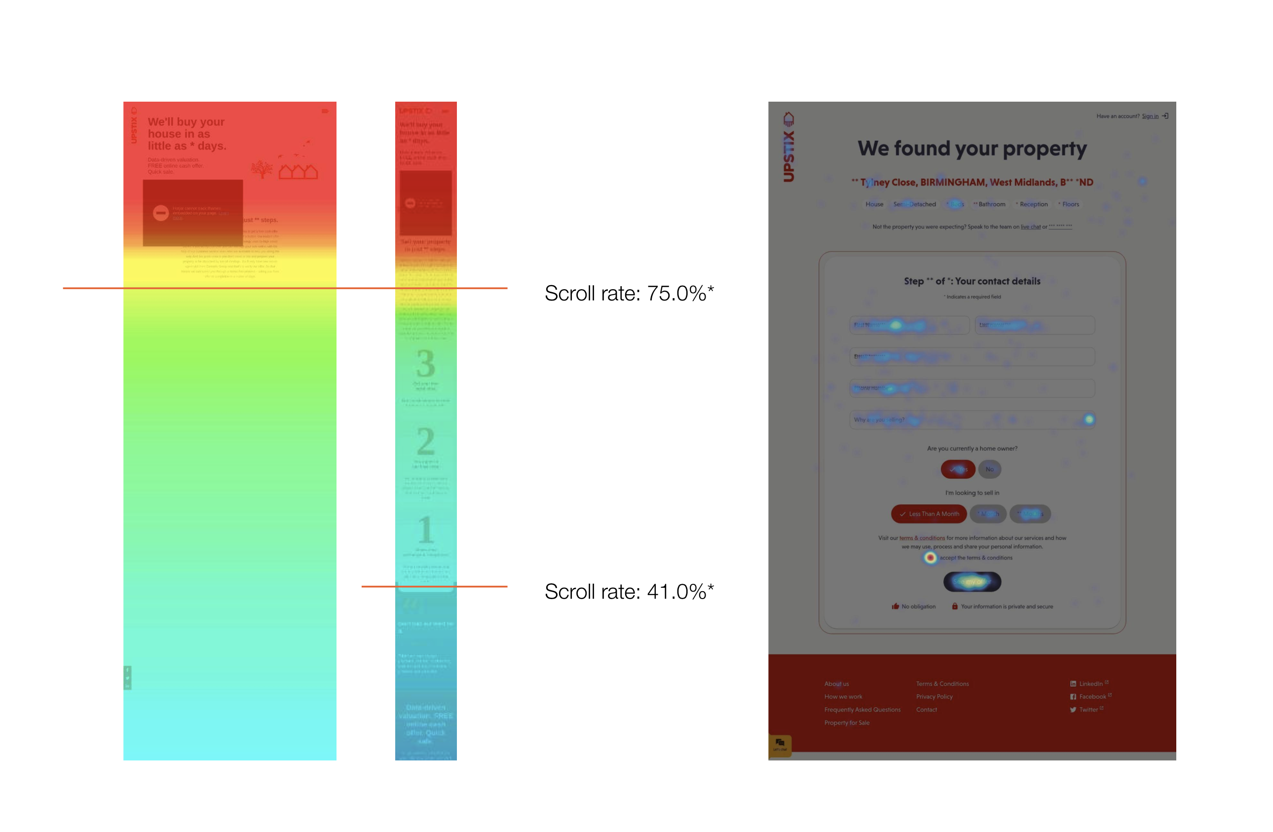
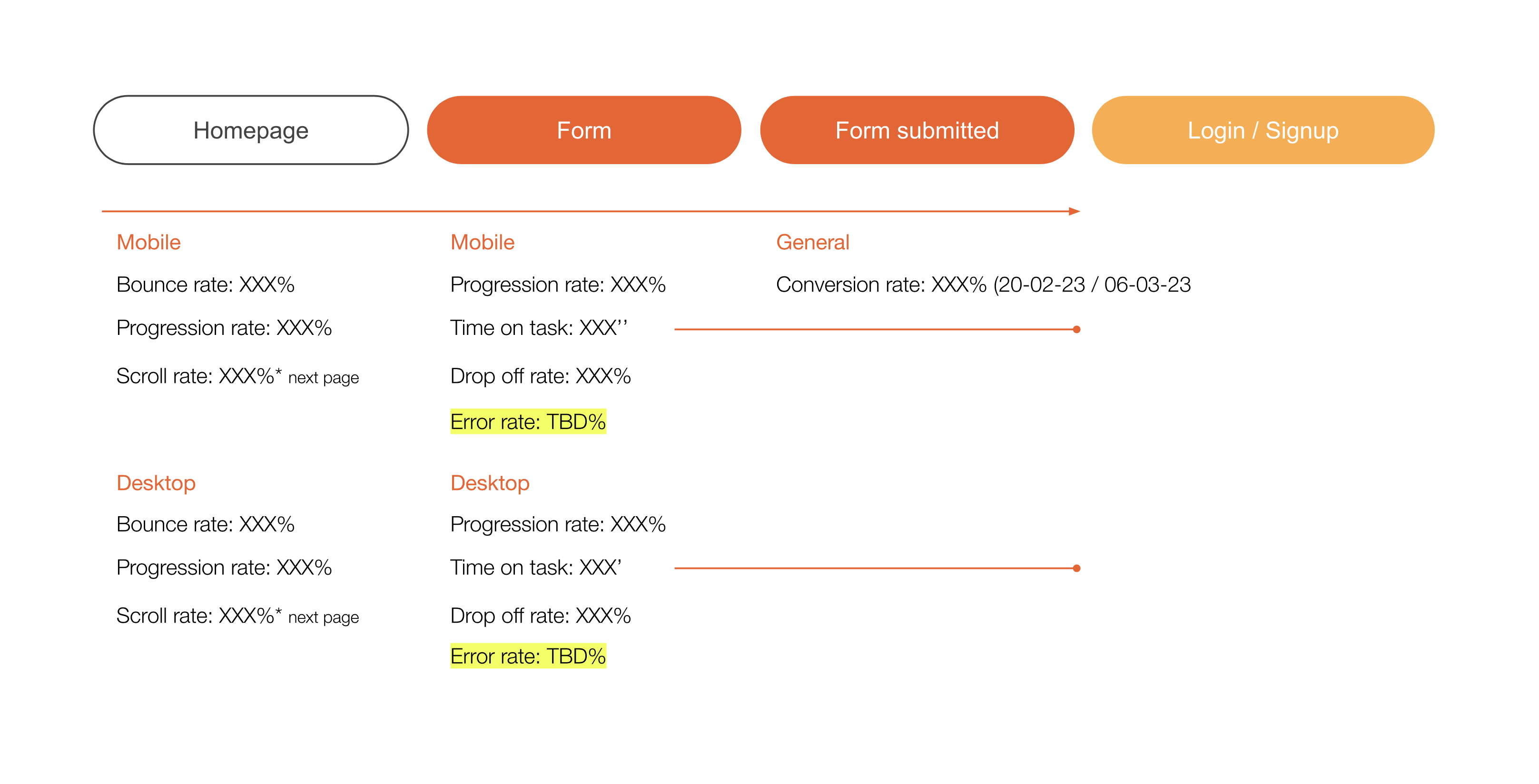
We utilized analytics, heatmapping, and scroll rate data from Hotjar to establish a baseline aligned with our KPIs for the conversion funnel. The key focus of our project is to enhance KPIs in the conversion funnel, including bounce rate, progression rate, scroll rate, and time on task. These insights from Hotjar provided a solid foundation for understanding user behavior and identifying areas for improvement in our targeted KPIs.
Below is an image of the conversion funnel baseline (confidential data has been removed).
Learning
The absence of error rate in analytics revealed the necessity for a solid tracking plan, crucial for form optimization. Without specific error data, our focus on improving forms relied heavily on heuristics, emphasizing the importance of accurate tracking for informed enhancements in user experience.
Competitive Benchmark
Based on the findings in competitors, we can categorize the opportunities for improvement for Upstix into several common groups. By addressing these key areas, we can optimise the conversion funnel.
- Clarity in Product Value:
Clearly articulate the value of the product in three concise statements.
Emphasize the distinction between an estimate on the property and the actual offer provided.
- Trust and Reputation:
Prioritize building and showcasing a positive reputation on platforms like Trustpilot, Feefo, and Google Reviews.
Ensure a transparent and trustworthy approach to handling user data, emphasizing privacy policy agreements.
- User Journey and Convenience:
Simplify the user journey by capturing essential information early on, such as email, without the need for extensive profile creation.
Highlight the advantages of Upstix compared to the traditional market process, particularly focusing on timing.
- Clear CTA:
Implement a very clear Call to Action, such as “Get cash offer,” to minimize any potential for user misunderstanding. - Communication of Offers:
Clearly communicate the offer after any necessary disclaimers, ensuring transparency in the process.
Browse the competitive benchmark below, alternatively use the following link: Upstix Competitive Benchmark
Conversion funnel heuristic evaluation
Issues were identified in the Upstix platform’s conversion funnel, including a lack of clarity on cash offers, and potential user confusion between evaluation and genuine offers. Enhancements like improving the visibility of the ‘Get my offer’ CTA, capturing emails on the homepage for retargeting, and addressing accessibility concerns in field states were suggested. Streamlining explanations, optimizing white space, and refining design elements were emphasized for a more user-friendly experience.
Browse the heuristic evaluation below, alternatively use the following link: Upstix heuristic evaluation
Detailed report: Table of Opportunities

User testing plan
- Research Objectives: We define research objectives to target during the test, so we are sure to cover all our doubts.
(findability & desirability, utility, credibility, usability, mental effort on the funnel, validation of user expectations at the end of the funnel) - Screening: To test with the right audience we sampled users who previously went through the sales process of their property.
We create a script to give users a real scenario and to evaluate specific factors that influence the UX of the funnel. In this specific test, we run a balanced comparison between two possible outcomes of the funnel.
Browse the user testing script here: Upstix User Testing Script
Conversion funnel user testing
The unmoderated user test aimed to gain insights into the Upstix platform’s effectiveness, focusing on aspects crucial for conversion. The findings highlighted key areas where enhancements could significantly impact user experience and, ultimately, conversion rates.
Key Findings:
- Process and Charges:
- Users lack clarity on the selling process and Upstix charges.
- Mitigation: Implement clear, concise explanations about the selling process and transparently communicate Upstix charges.
- Company Trust and Credibility:
- Concerns about the financial clout and reputation of Upstix.
- Mitigation: Add Trustpilot references on the homepage and work on brand awareness to enhance reputation.
- Brand Credibility:
- Users question the brand’s professionalism and website design.
- Mitigation: Improve the website design to establish a more professional image consistent with competitors.
- Usability – on the Form:
- Users express discomfort with specific questions in the form, questioning their relevance.
- Mitigation: Remove non-mandatory fields like “why are you selling” at this stage and clarify the necessity of the “homeowner” question.
An example of a user testing can be found below. See here the related table of opportunities: Upstix User Test
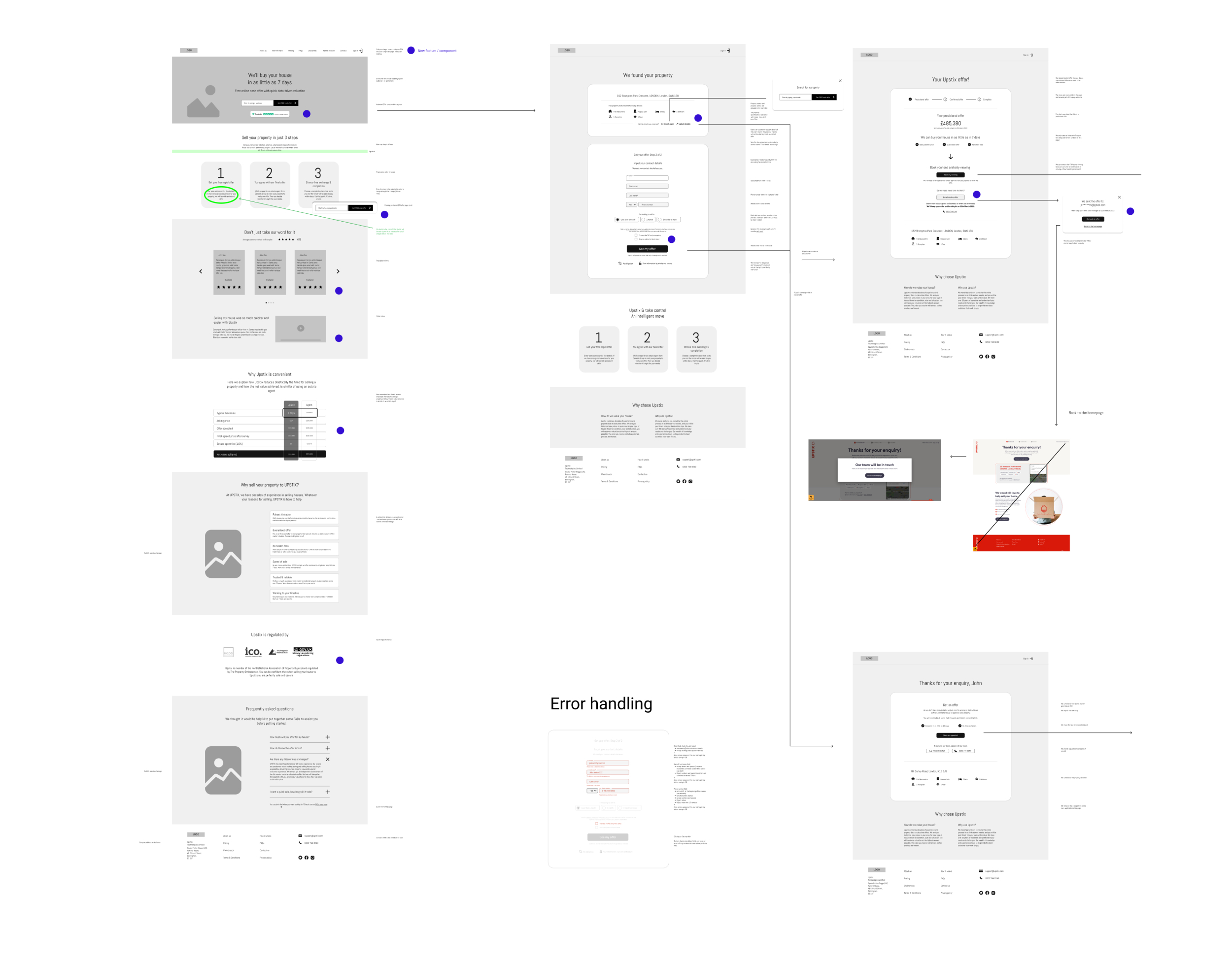
Wireframing
The wireframes consider technical limitations in collaboration with Upstix development, directly addressing findings from research, including heuristic evaluation, competitive benchmarking, user testing, and analytics. Two versions were designed: one for immediate implementation and a second version to address all identified issues.
See the conversion flow HI-FI wireframes below for a quick overview, alternatively open the Figma file: Upstix Wireframes

Learning
Often to optimise costs and budget we tend to validate through user test wireframes. Although, as in this case we Upstix, we must validate key research objectives related to the brand identity, such as trust in the company. for this reason, the prototype for the validation user test must wait until after the UI design phase.
Design & prototyping
During this phase, Upstix’s brand identity was undergoing development, providing the MediaMonks UI team with the flexibility to refine the design system for enhanced trust and user perception. The prototype, developed using Axure, allowed us to thoroughly test data entry fields in a reliable and accurate manner.
You can explore the mobile prototype below, spanning from the homepage to the final form submission conversion point.
Prototype available on desktop only
Additional tracking & revision plan
We established a tracking plan collaboratively with MediaMonks UX, data, and Upstix teams to cover essential points in the conversion flow. In a Conversion Rate Optimization (CRO) project with multiple data entry forms, we focused on tracking crucial metrics like form completions, drop-off rates, and error rates.
Collaborating with Upstix ensured a reliable plan, offering insights into funnel traffic. This approach allowed us to systematically evaluate improvements, ensuring statistical validity before implementing changes to the conversion flow.
Results & Takeaways
Upstix is pleased with the project’s outcome, especially the research approach undertaken by MediaMonks to boost the conversion rate. The collaborative efforts in refining the user experience and tackling key issues have resonated positively with Upstix.
They are now actively devising a strategic plan to implement the identified improvements over a defined period, showcasing a proactive commitment to enhancing their platform in alignment with the project’s findings and recommendations.